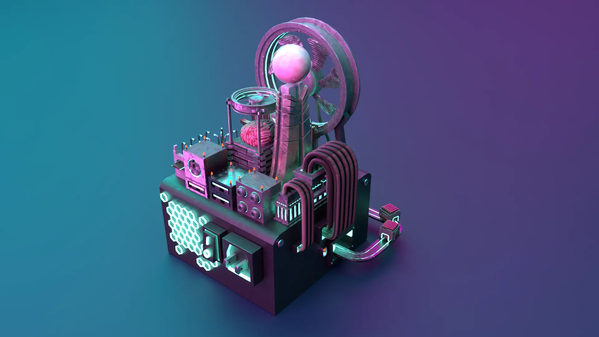
A metaphorical approach that mixes the meaning of human, city structures and computer parts to create a futuristic cyber city.
- Industry standard 3D modelling, texturing, lighting, & rendering
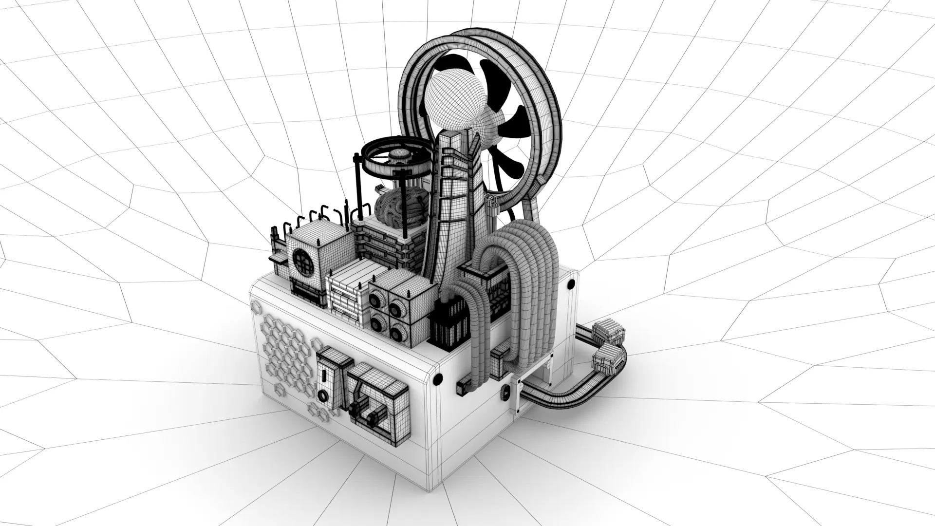
- Create a low-poly 3D isometric concept
- Apply 3D techniques to visualize mockups
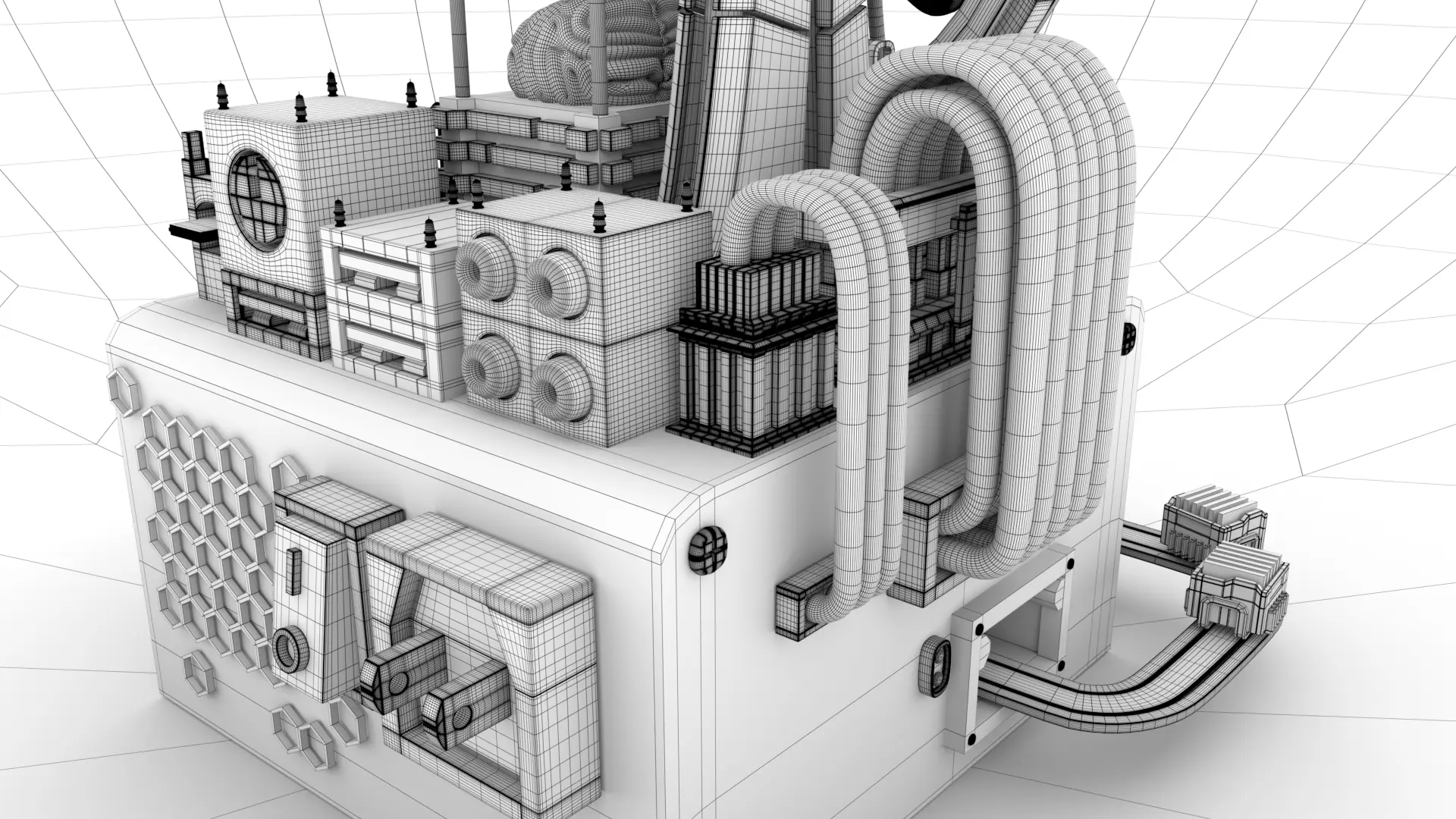
- All assets should be in quods
- Using Substance Painter for the first time for asset texture
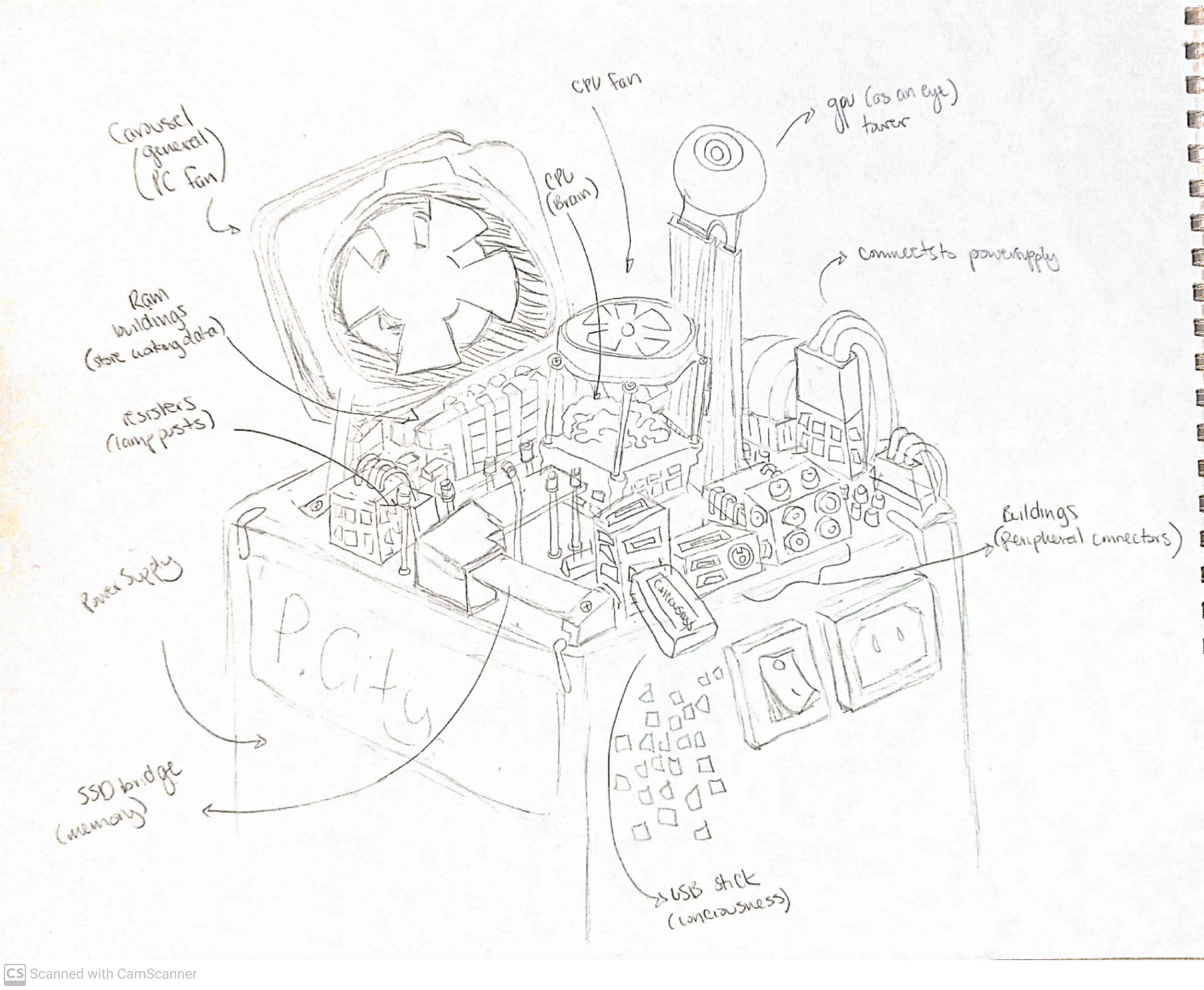
Concept Sketch
Took inspiration from looking into my PC case where certain parts can be attributed to the human mind. Such as the brain is the CPU, the graphics card is the eye, and the SD card is a highway.
Results
- Able to navigate technical issues and work progress with no issues
- Demonstrates a rapid acquisition of new skills and proficiency with industry-standard software
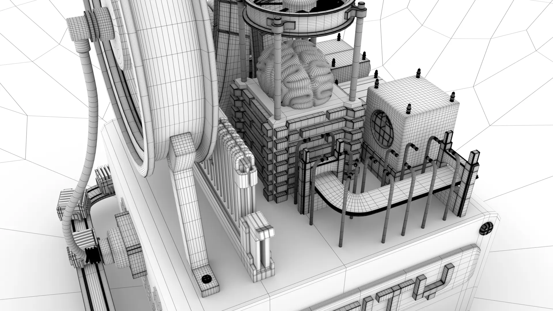
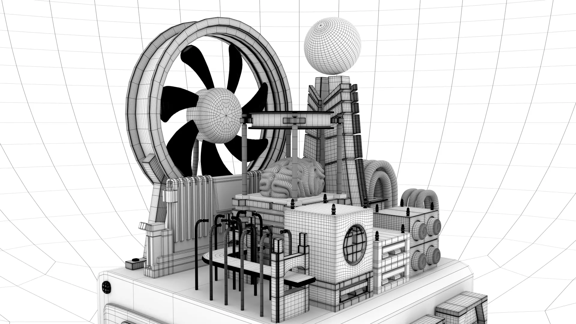
Breaking down primitive objects into desired assets from the sketch
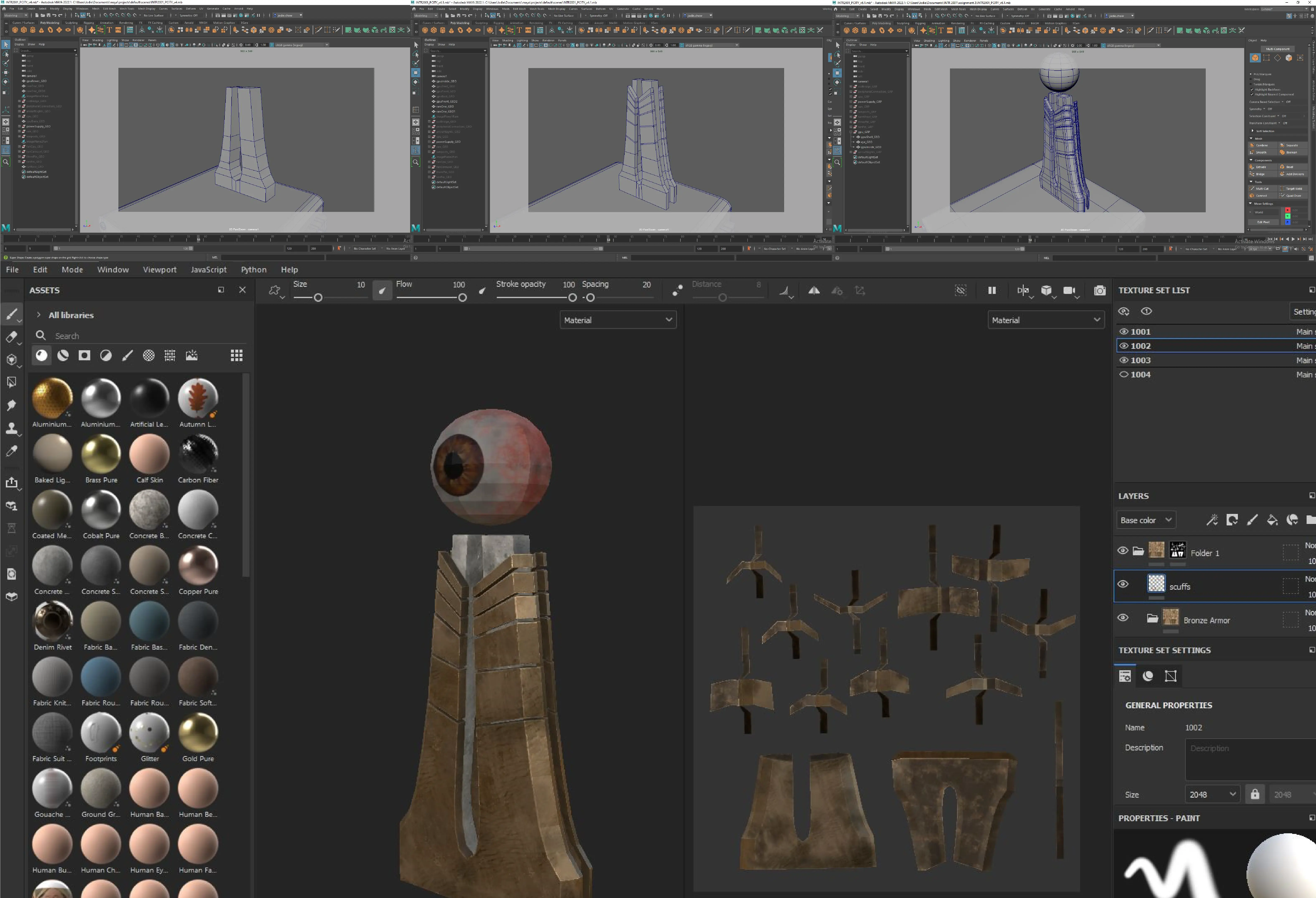
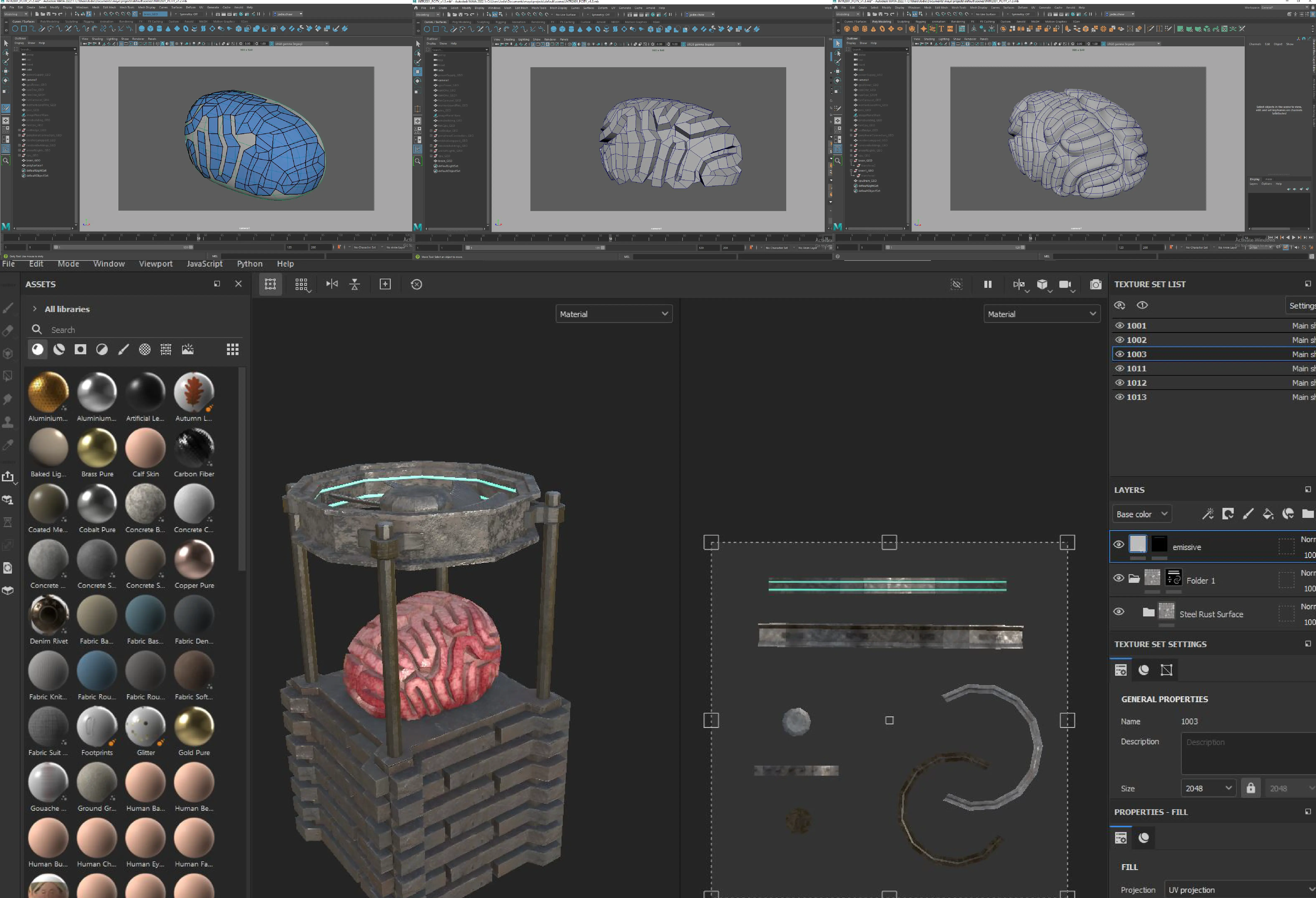
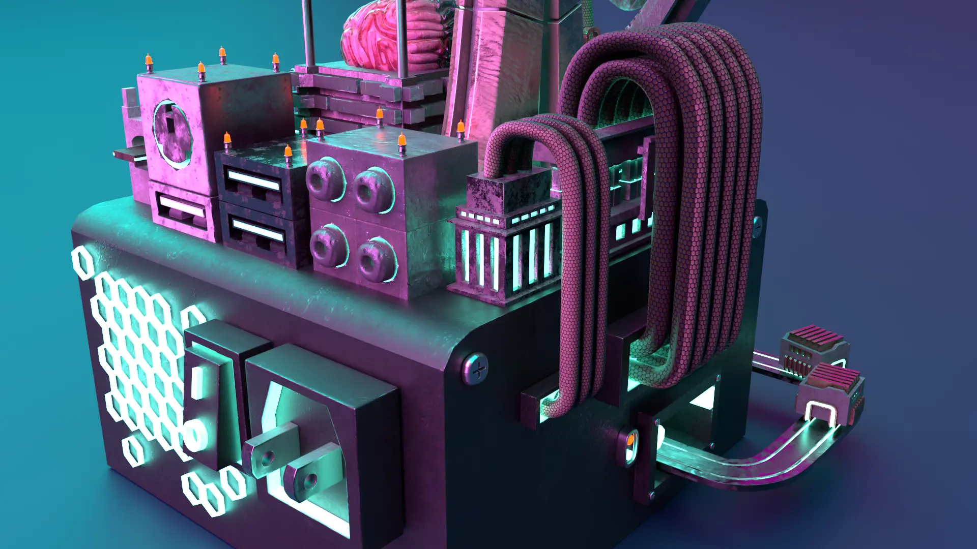
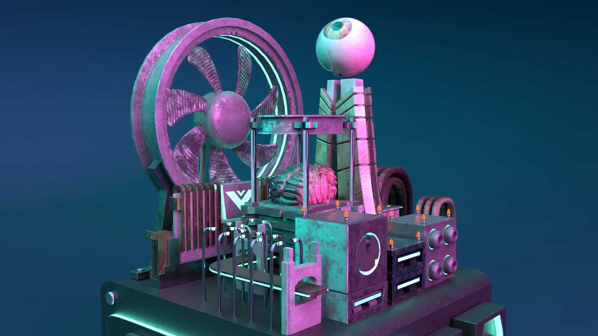
From using cubes, cylinders and spheres, I designed each part of the sketch above. The most challenging was created the brain as I had to create quads (squares) that snaked around a sphere to resemble a brain and extruded outwards.

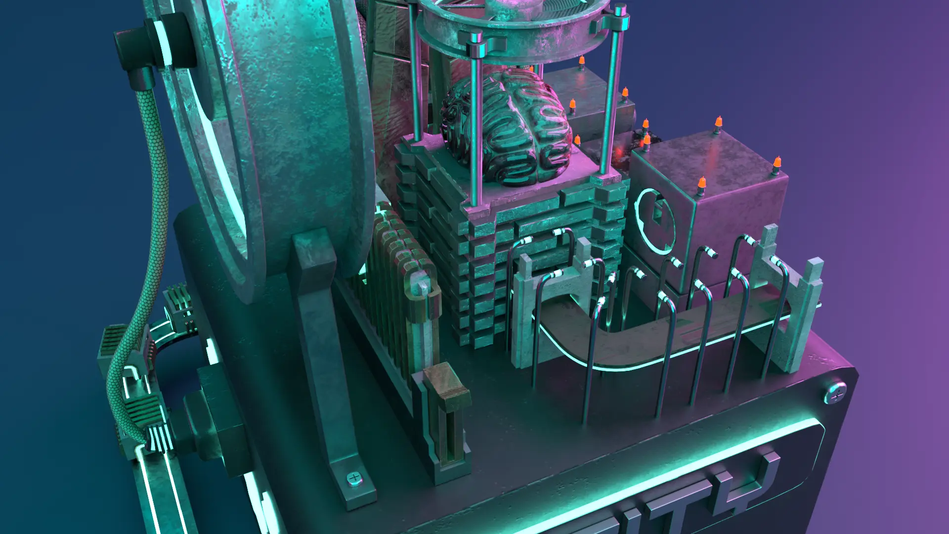
Creating textures in substance painter
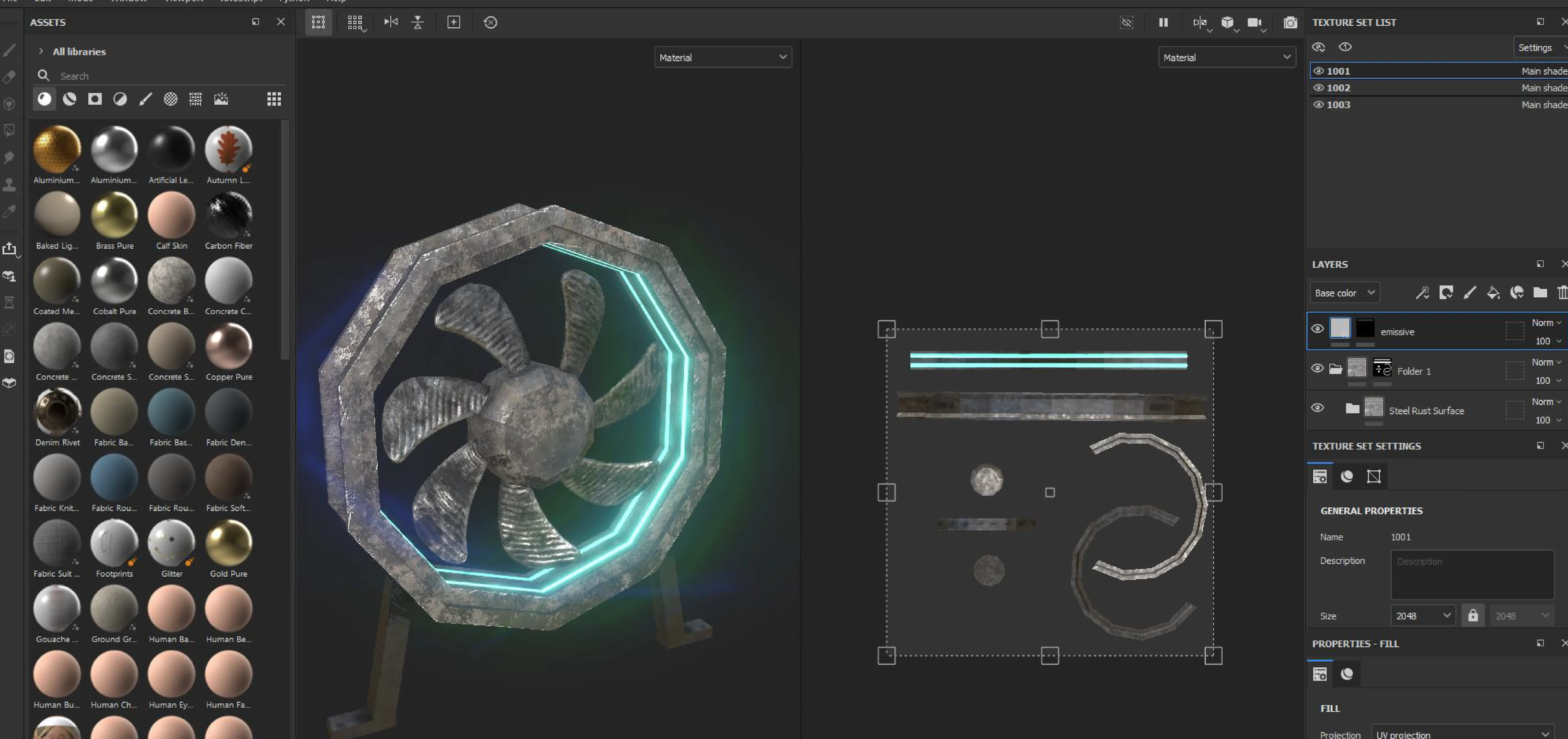
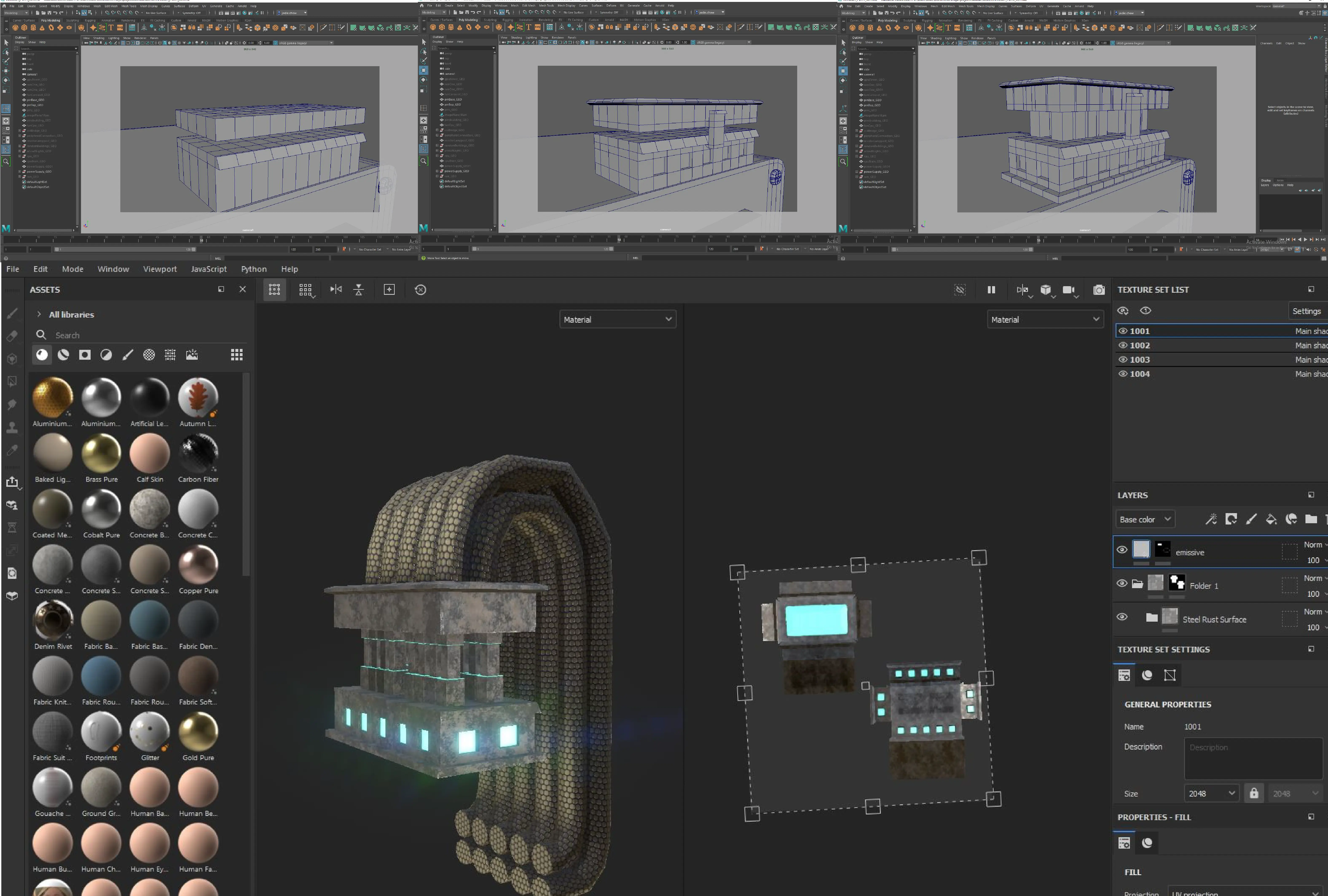
Before creating textures, each asset was appropriately unwrapped in the UV editor so that the texture wont distort. Each object was added in substance painter with a rustic material layer and some of the pieces were painted with neon lights.
Graphics card is the eye
CPU is the brain
Motherboard 10-pin building
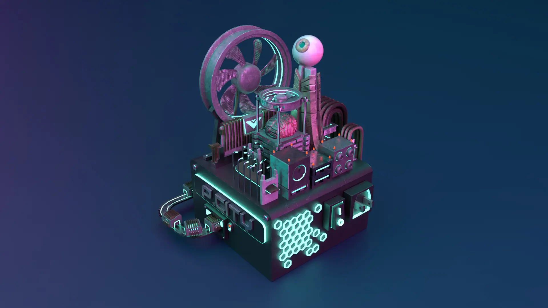
Final rendered scenes with Photoshop
Before creating textures, each asset was appropriately unwrapped in the UV editor so that the texture wont distort. Each object was added in substance painter with a rustic material layer and some of the pieces were painted with neon lights.
Reflecting on the project outcome and areas of improvement
I was anxious with how to approach this project because I never used substance painter. I did not understand if there were any limitations to my concept especially the neon lighting. My professor gave feedback and insight on how to approach it that allowed me to navigate substance painter and complexity of my models.
Some key takeaways from this project are:
- Initially, I thought creating a background for the piece would be challenging mix of photoshop and maya. However, I learned that adding a sphere with background lighting makes a seamless render.
- Substance painter enables real time render and details of each asset versus photoshop is flat with no texture and harder to estimate texture orientation.
