A concept mobile app that children and adults can use to navigate Sick Kids Hospital
- Development of the AR experience in SparkAR
- Branding and UI/UX design assets
- Project coordinated our team of 3
- Create a brand that was minimal and organic to appeal to our users
- Using SparkAR to allow design inception to deployment test
- Create an MVP mobile app
- Identify strengths and pitfalls of our first iteration and redesign a better solution
- Using SparkAR for the first time
Results
- Recognized the linguistic diversity of Toronto and implemented a feature for language selection in the app interface
- Redefined way-finding methods by introducing a friendly mascto to guide the way for children
- Created a more vibrant and engaging brand that was more appealing and engaging in contrast to the hospital environment
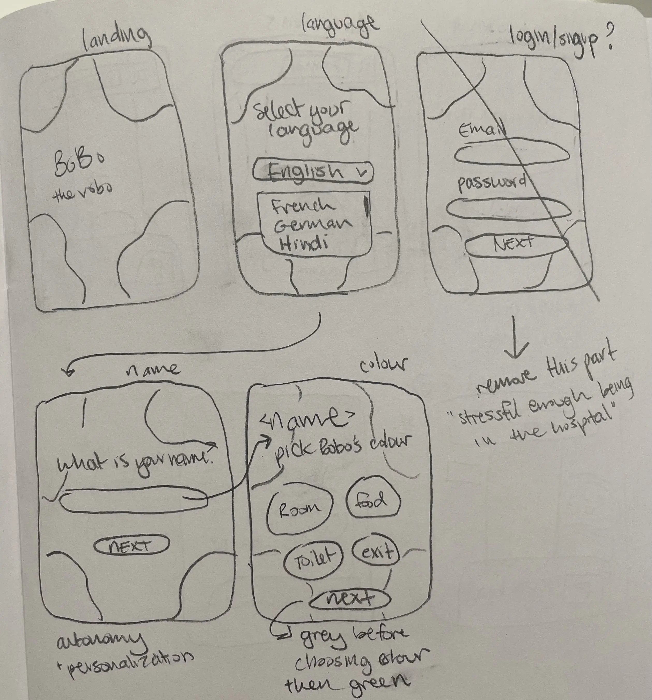
Creating proof of concept: iteration #1
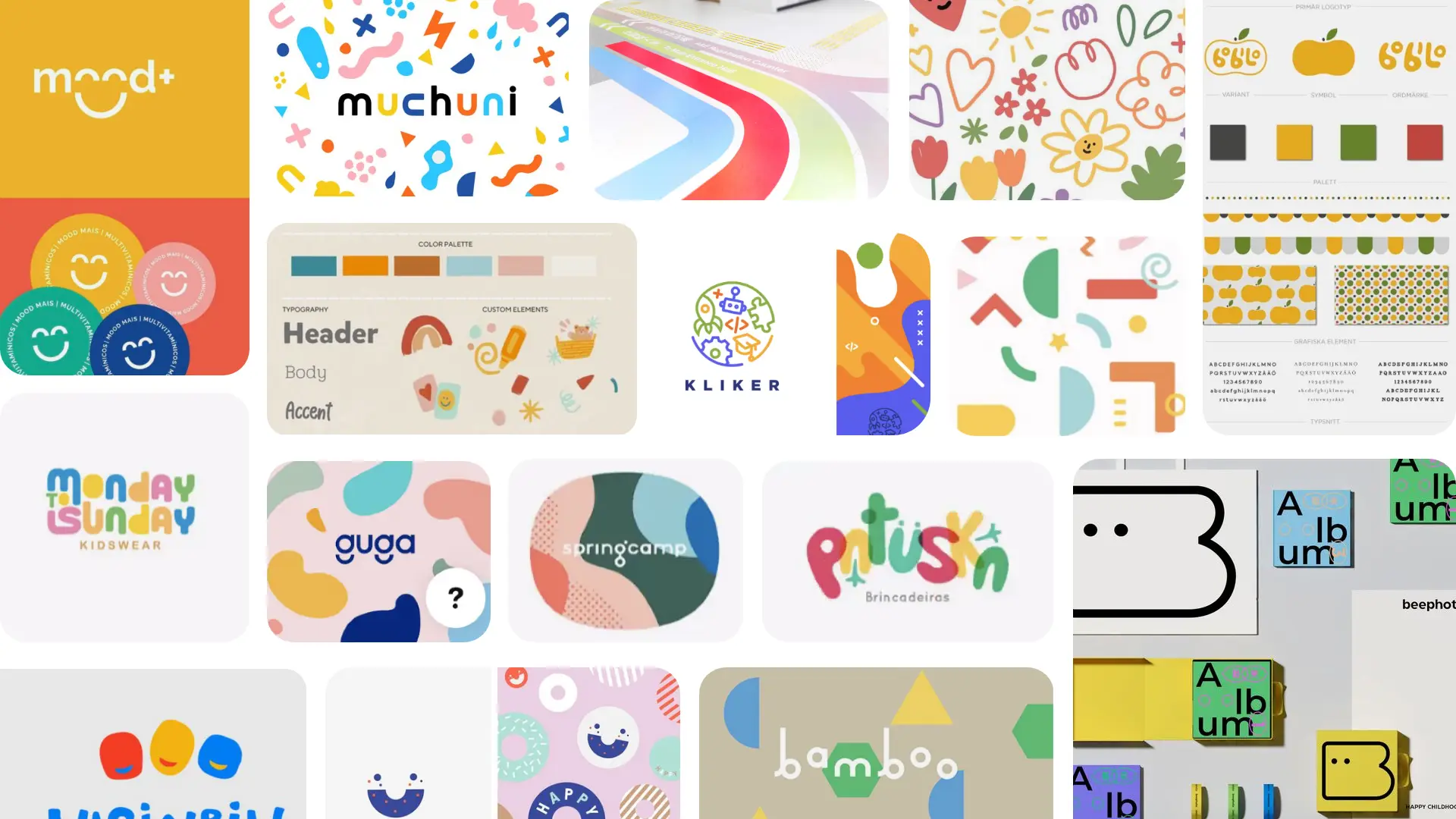
We delved into a plethora of playful and organic children's branding concepts. The essence of our exploration was to cultivate a vibrant and whimsical aesthetic that resonates with young users. This pursuit is rooted in the recognition that:
During our research we noticed that:
- children find themselves in environments predominantly managed by adults, offering them limited autonomy
- hospitals feel vast and often overwhelming where children can feel small and insignificant due to their size
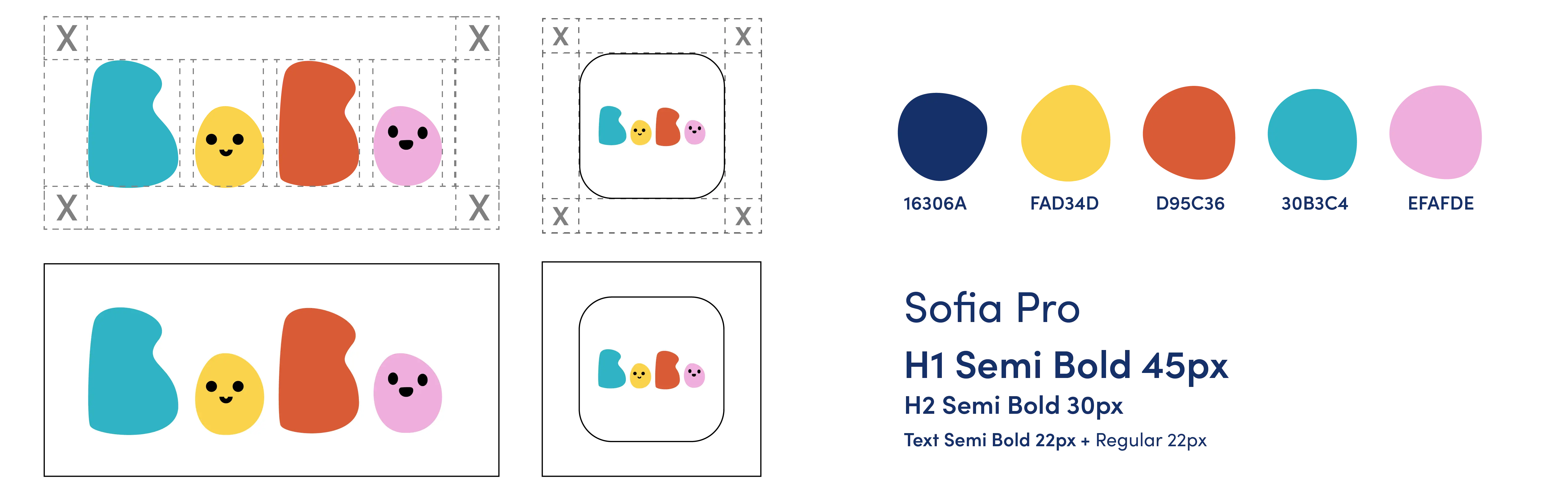
Branding and visual identity
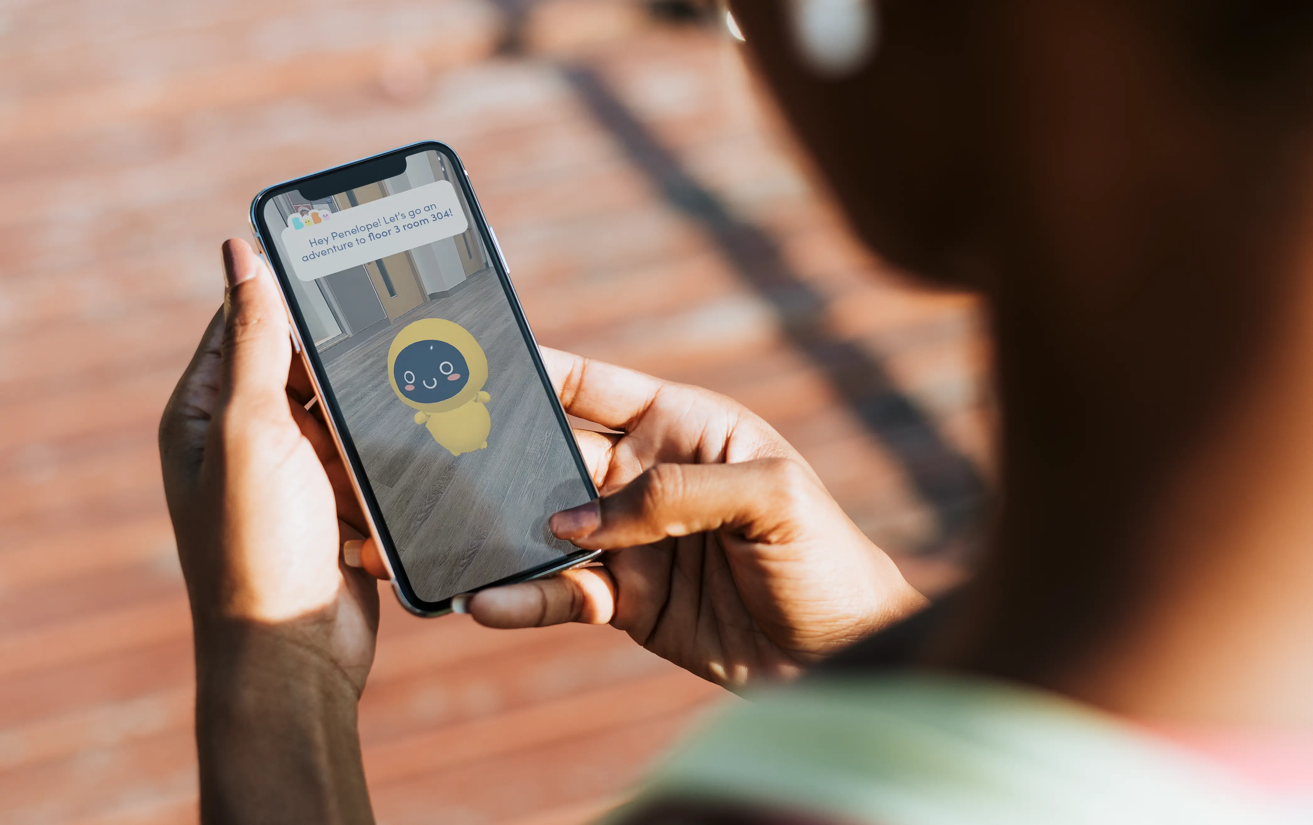
A big hospital can be overwhelming for a child. Our group re-evaluated the conventional way-finding methods and proposed an AR mascot that is child-like in personality that is not taller than the child. This mascot is a guide that will direct the child on where to go.
We also took account that our chosen text and colour is legible and WCAG approved.
Narrowing scope of work by defining our MVP
To avoid an overwhelming amount of development for our first iteration, I decided that we should focus on a few features that the app could not service without to keep it clean and simple:
- Must have audio and text aid on each screen for the augmented reality function
- Bobo the AR mascot wont leave your side and will walk with you to your destination
- Allow users to search their room and floor level
Creating proof of concept: iteration #2
Our team set out to narrow our scope and focus on locations within Toronto that we could go experience and immerse ourselves first-hand.
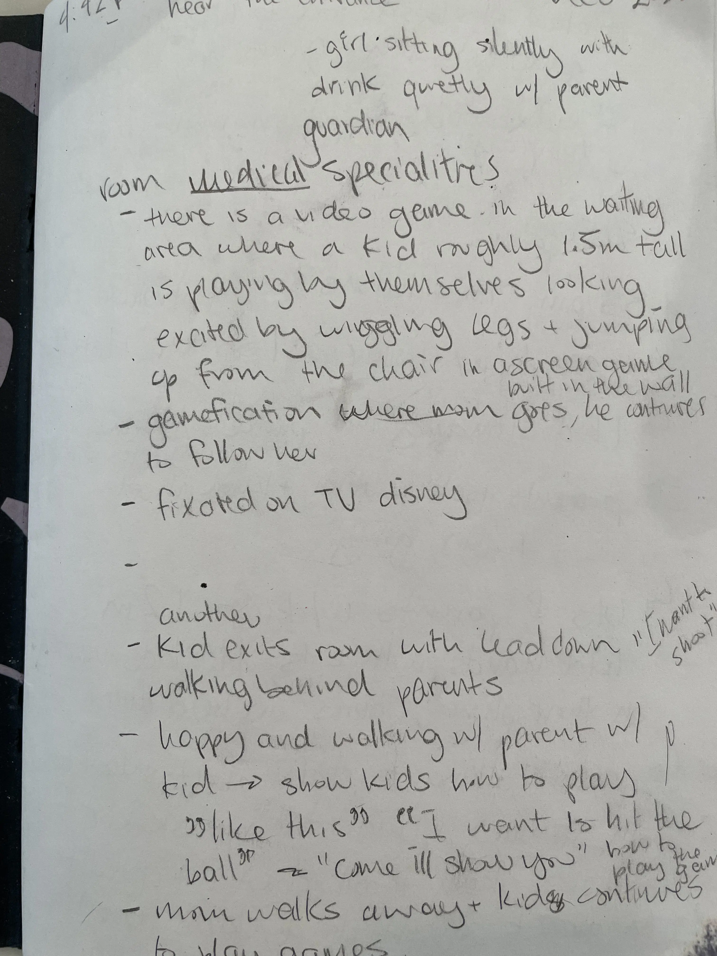
My teammate and I set out to collect data by going to Sick Kids Hospital for participant observation as well as understanding the environment of where our application will be used in. We spent 50 minutes around different areas of the first floor.
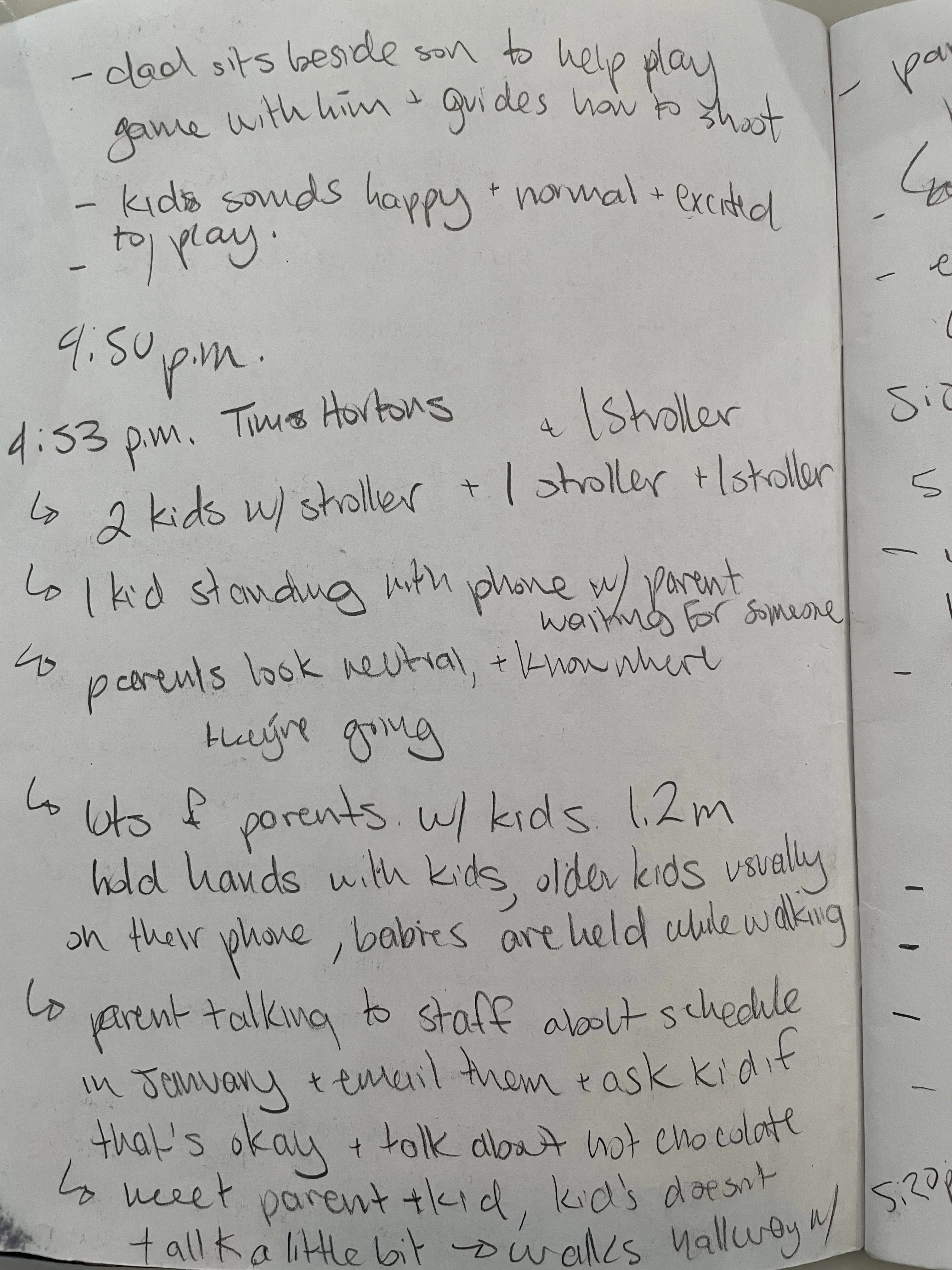
Identified issues
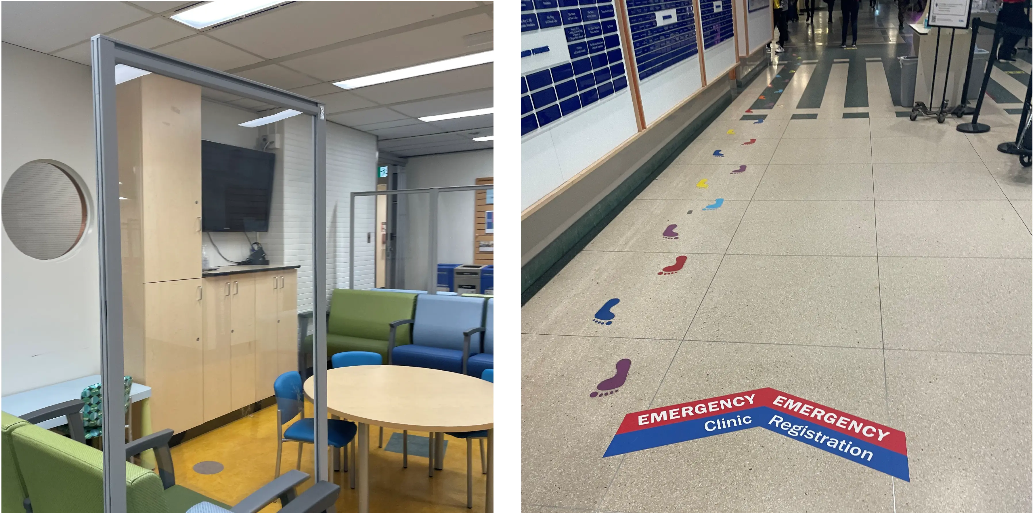
- There was only one small waiting area that had an interactive game
- Kids would stick closely with the parent through the halls and when talking to another healthcare worker
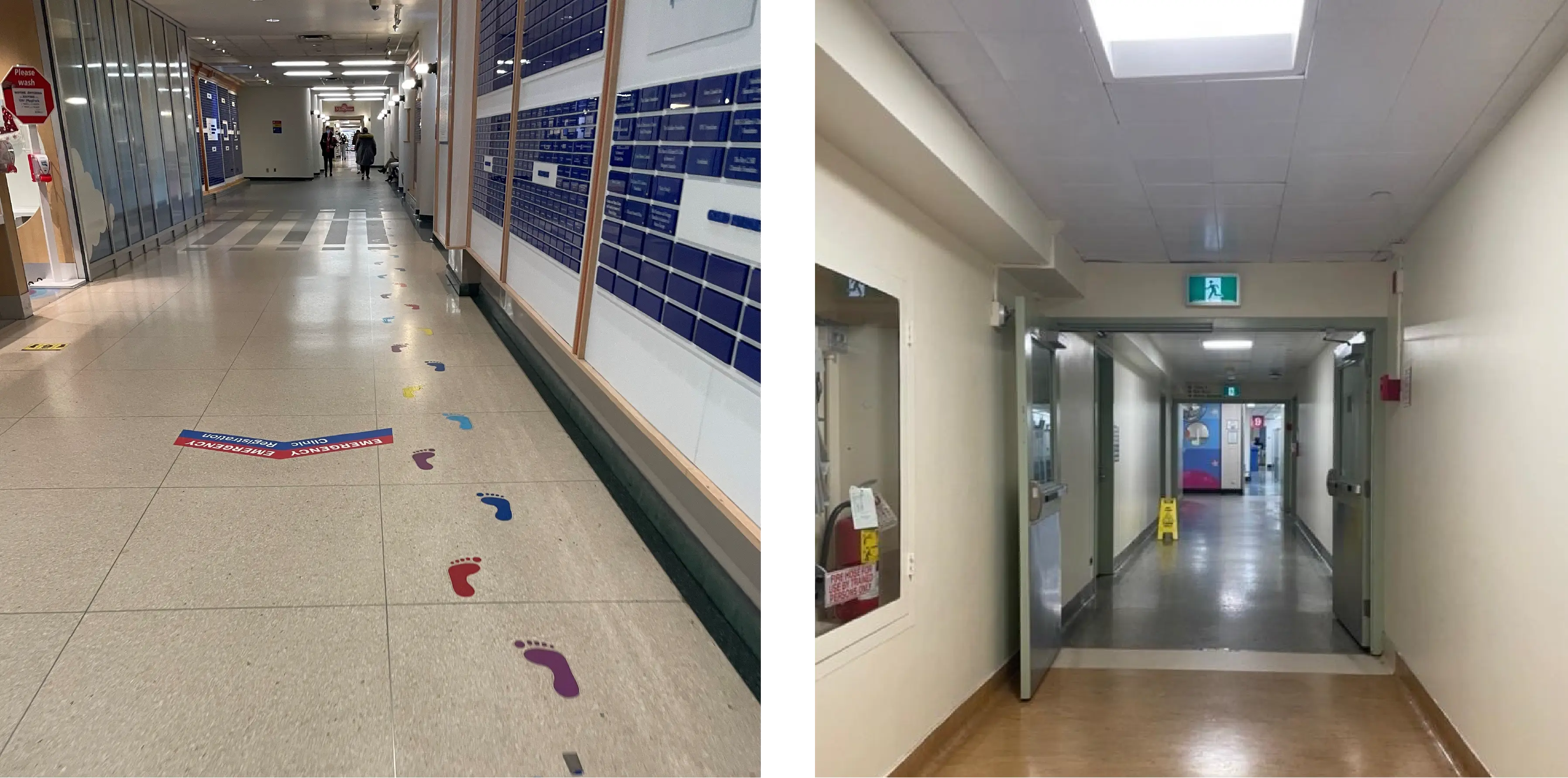
- Confusing way-finding stickers on the floor that begin and end randomly and is not accessible for people who are blind
- Different families from different ethnic background speaking their native language
- Dimly lit hallways and muted colours and decorations throughout the hospital
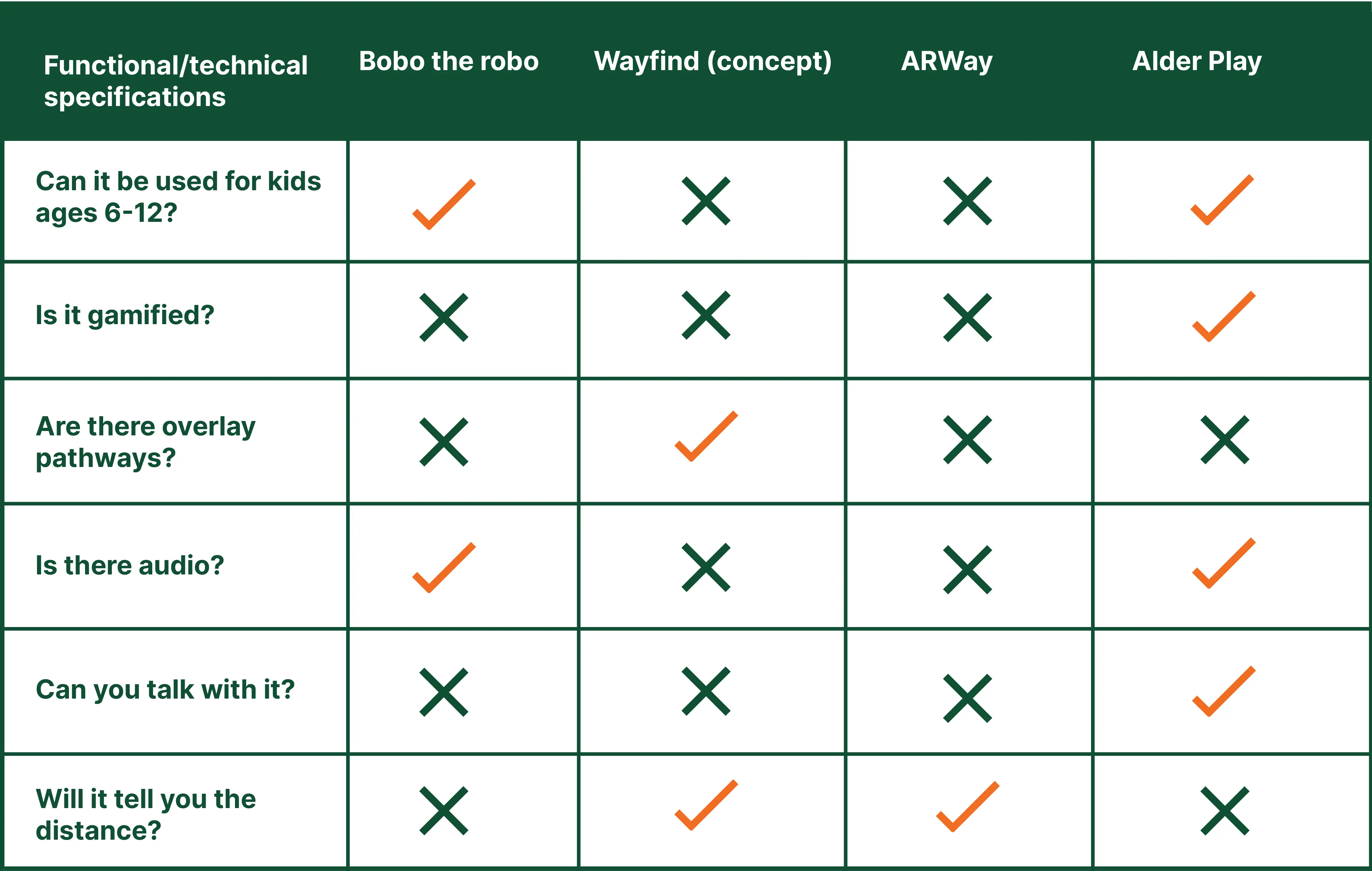
Comparing our app with similar existing apps
Compared existing healthcare market for similar AR way-finding applications to our existing prototype from our first iteration. Only 1 of the 3 competitors were targeted towards children.
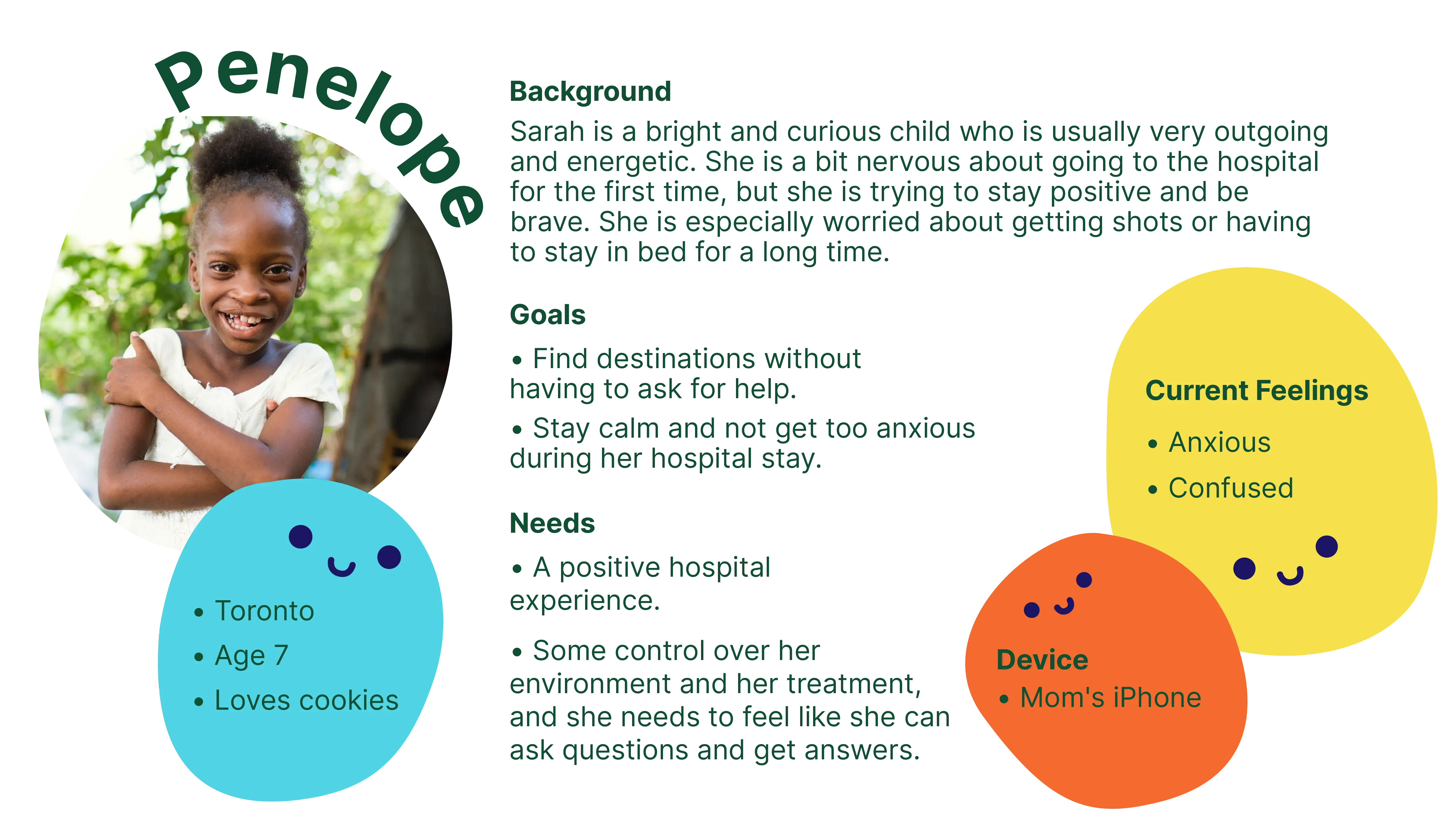
Generating Persona based on the information collected
The second version of our persona reflects children that I saw within the hospital as well as the data collected online. This child reflected someone who is nervous, shy and anxious when entering the hospital for the first time. Penelope’s end goal be able to play, be confident and have fun like she does at her house and at school.
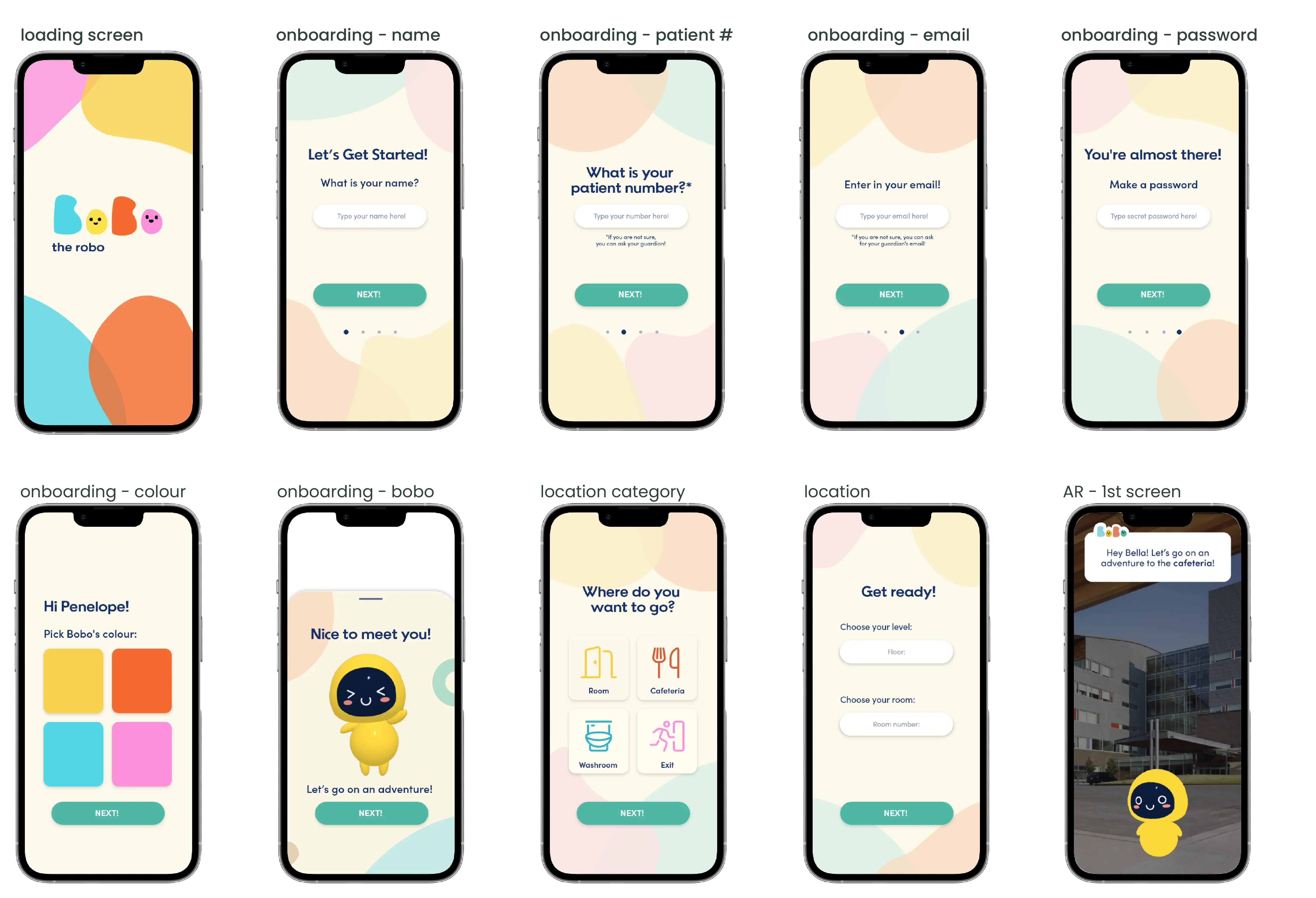
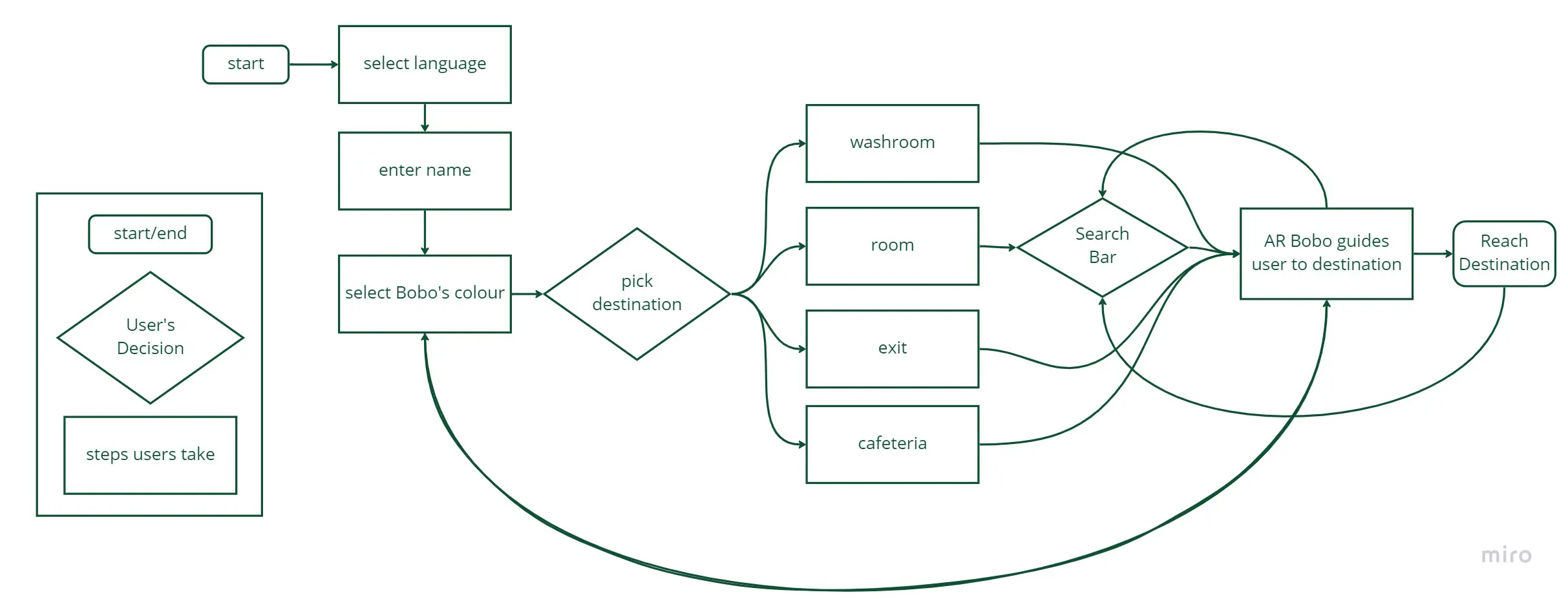
Generating user flow using the core features
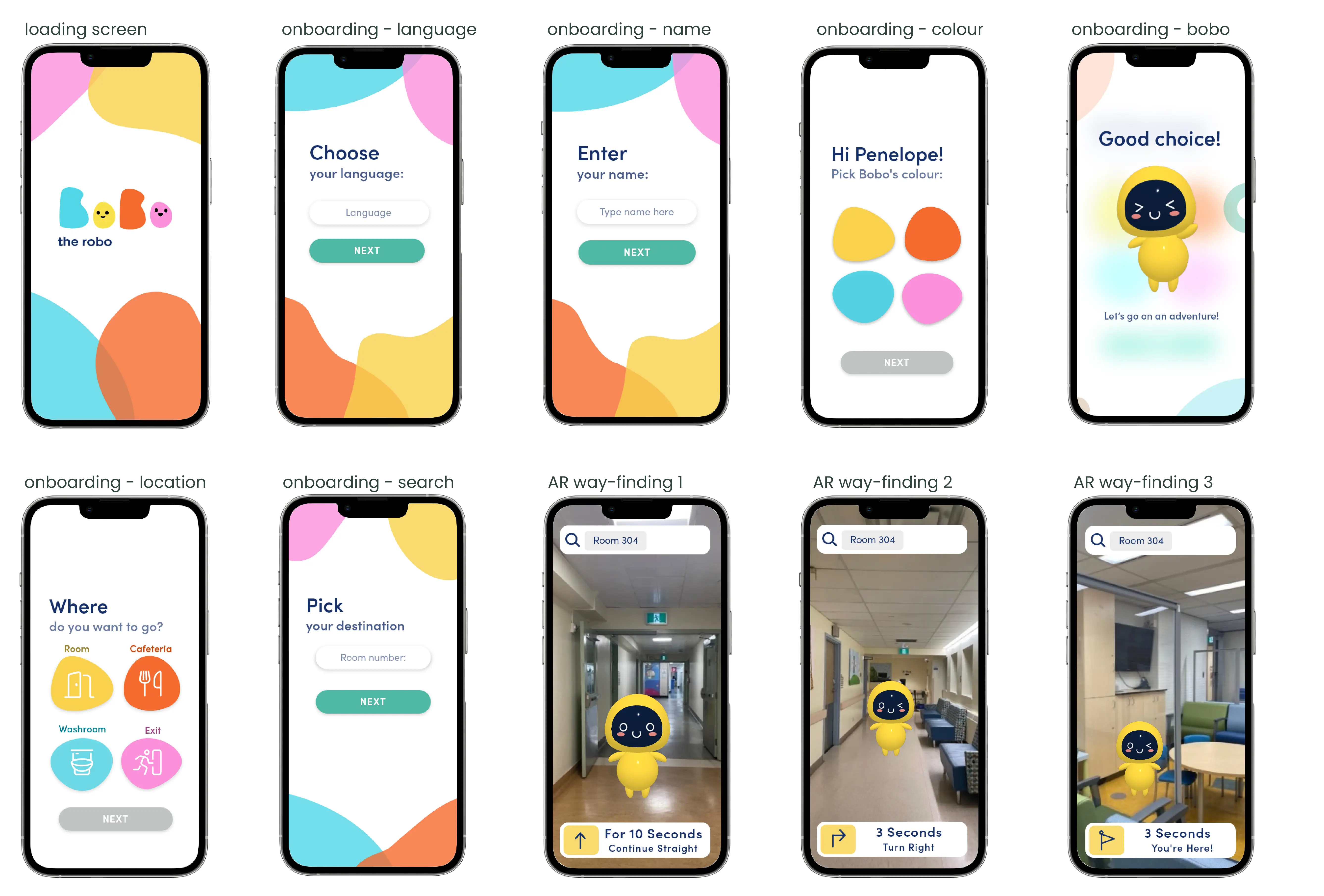
Our team collaborated to refine our user flow, prioritizing simplicity in the onboarding process. Our goal was to expedite the user's entry into the AR experience, ensuring they swiftly encounter Bobo. By streamlining the steps, our aim was to cultivate a sense of ease for the user, guiding them effortlessly to their intended destination.
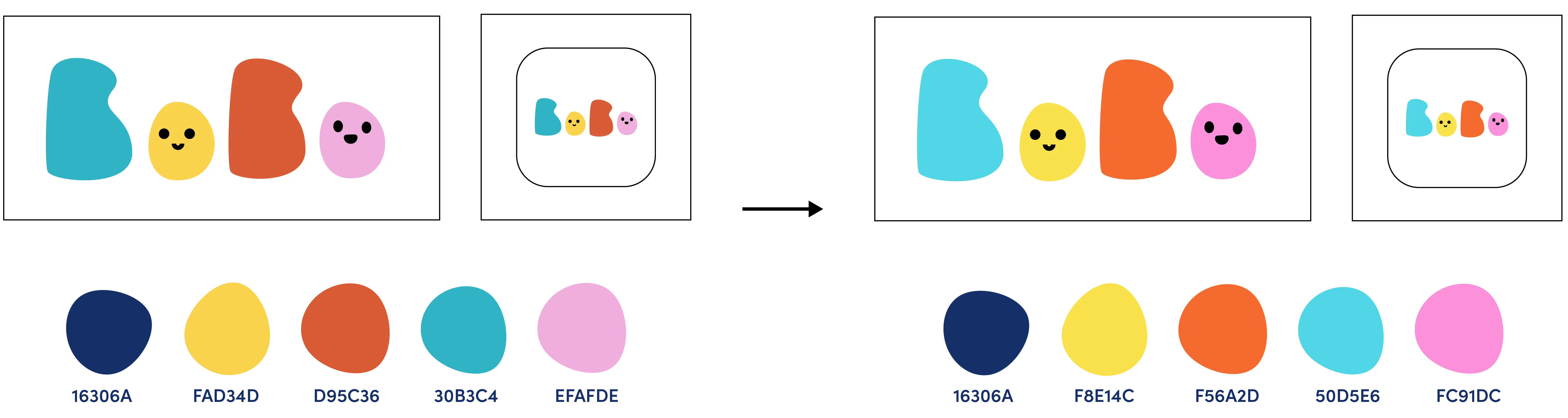
Making our brand colours more vibrant
During our observations at the hospital, we noticed that the lighting was dim and the colors used in the environment were muted. In response, we decided to incorporate vibrant and positive colors into our design in order to keep the children engaged and optimistic. We also chose a playful and legible font to further enhance the user experience for kids. These design decisions were made with the goal of creating a more enjoyable and engaging experience for the children while they are in the hospital setting.
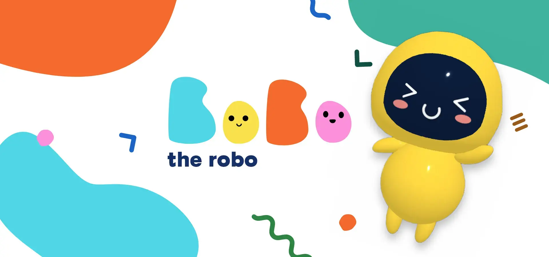
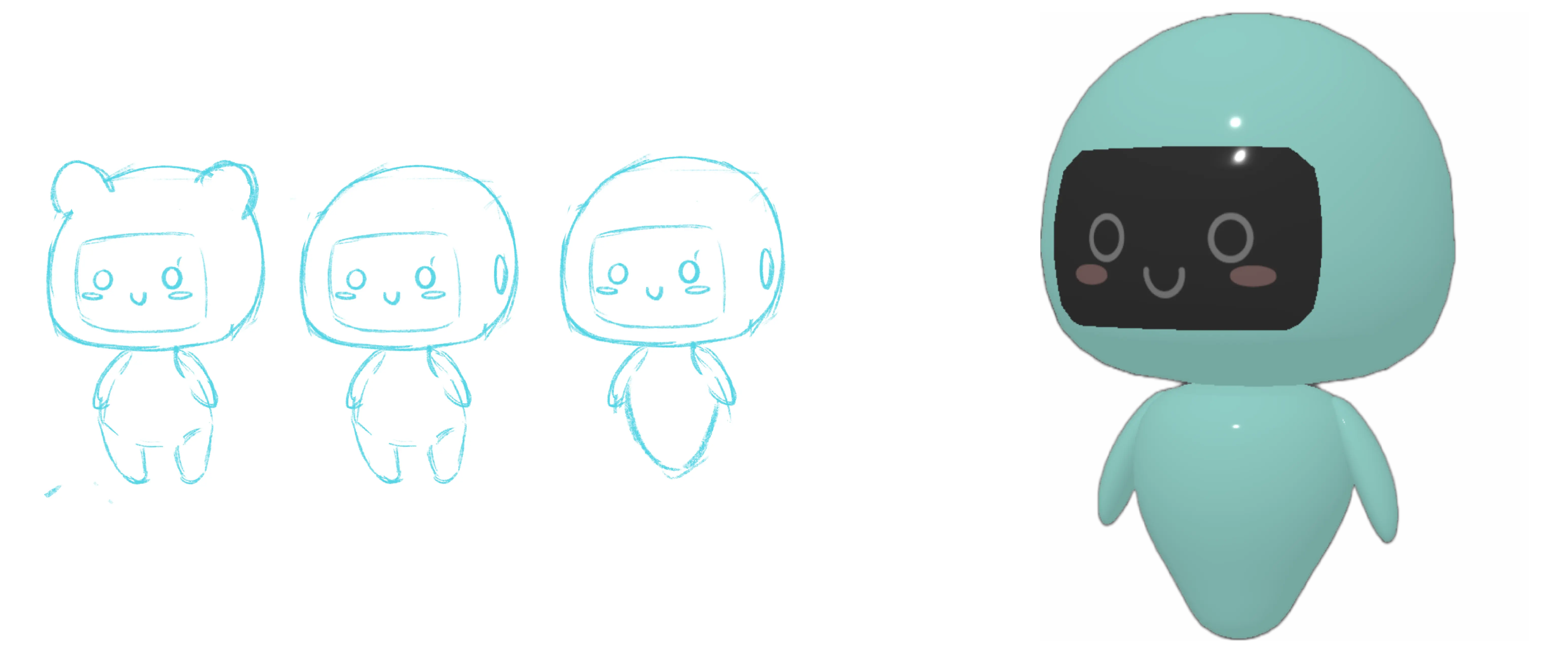
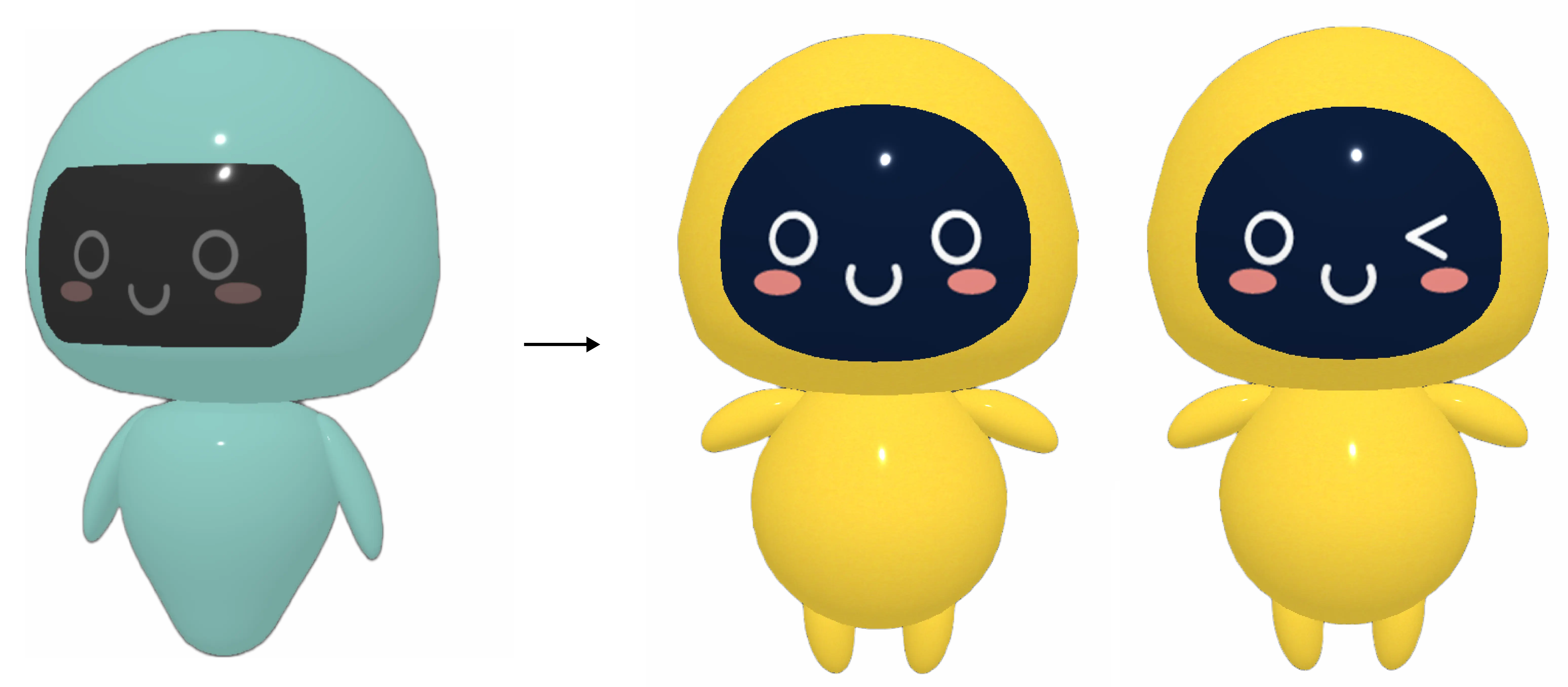
Making our mascot more human-like and approachable
After reviewing the first iteration of Bobo, we determined that the design of Bobo is inconsistent with our visual identity. Our visual identity consists of natural, organic shapes whereas Bobo was robotic and geometric that did not feel welcoming for a child.
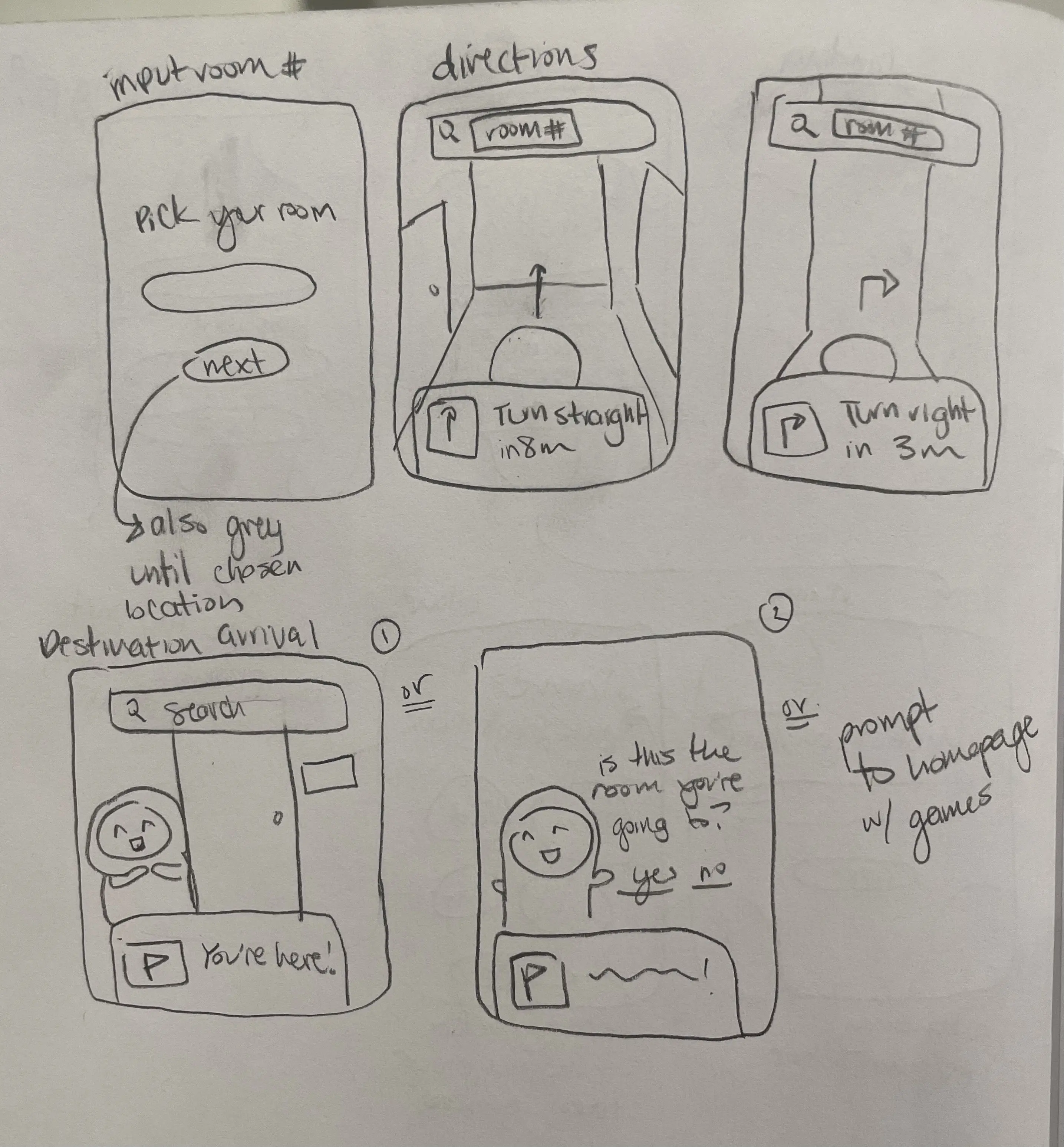
Re-evaluated scope of work by defining our MVP
During our research we noticed that:
- Select language as the first onboarding screen to overcome any language barriers
- Allow users to quickly search their room in the search bar in the AR screens
- Bobo the AR mascot will guide you to your destination with a preview of the directions
- Removed registering/logging in feature from our first iteration
- Quick search by adding a search bar in the AR screen
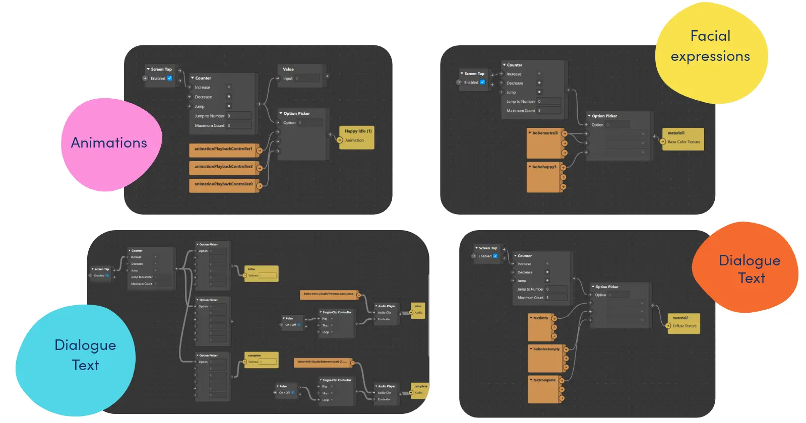
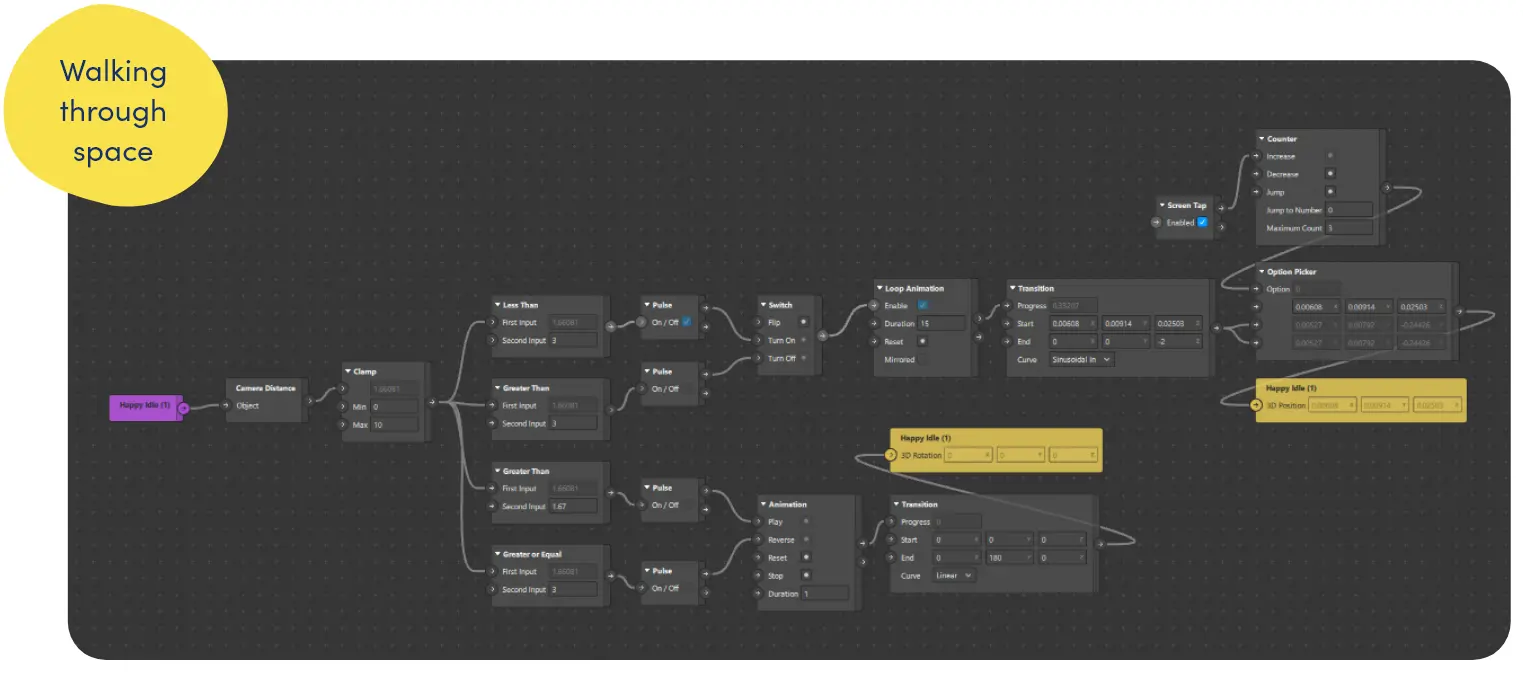
Combining the mockup and animation Bobo to walk to your destination
Using the patch editor, I made bobo interactive by allowing the prompt “screen tap” to trigger the sequence of animations that allow bobo to idle, walk and wave in that order. I used mixamo to rapid-animate and rig the model. We also made bobo interactive by changing its facial features with each animation and allowing bobo to have a very cute and funny voice.
- Challange: was finding the right patches to make bobo walk to the desired distance and turn around. By using a set of conditionals relative to the camera distance, bobo was able to walk and turn around to guide users.
Reflecting on the project outcome and areas of improvement
To push our app further, we would definitely create this app in Unity to create a seamless experience that integrates the augmented reality (AR) elements. In addition to the AR features, we plan to add small games and other interactive elements, such as short conversations or games with Bobo, our in-app character.
Some key takeaways from this project are:
- Doing user research and competitive analysis had a significant impact on the project. These activities helped me identify strong UX points that can informed changes to the UI elements. I learned that is these steps are skipped, it can lead to making significant changes to the project later on which costs more time.
More fun stuff I’ve been up to