A B2B platform that simplifies clients' highlighted business operations by optimizing marketing and communication workflows across diverse industries.
- Lead UX Researcher
- User Test plan and execution
- Created wireframes which translated to hi-fidelity mockups
- Worked closely with creative director, senior UX designer, and developer
- Prioritize recurring pain points faced on the website
- Outline user test plan that informs us about the current website
- Synthesize and analyze quantitative and qualitative information from the user tests
- Reusable methodology to test other DCM sites
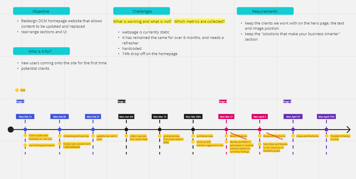
- Establish realistic timeframe of each step
- Connect and collaborate with the design team to review process and findings
Results
- Informed and educated the design team of the process to get to create an impactful user test
- Highlighted recurring issues (language and website structure) faced on the website
- Created robust user test methodologies backed up with reliable resources.
Identifying who the users are and understanding the problems
I interviewed with the creative director and UX designer to gain insight on the business objectives, the development of the website and who the website is targeted towards.
We highlighted some problems:
- Website is hardcoded and hard to update information or news
- Do users get what they need from the first page?
Led the user test and organized insights
Over the course of a few weeks, I did an audit of the website and affinity mapped possible issues under Usability Heuristics categories and pitched the steps of the plan.
I wanted to determine what i want to evaluate by identifying the specific usability aspects.
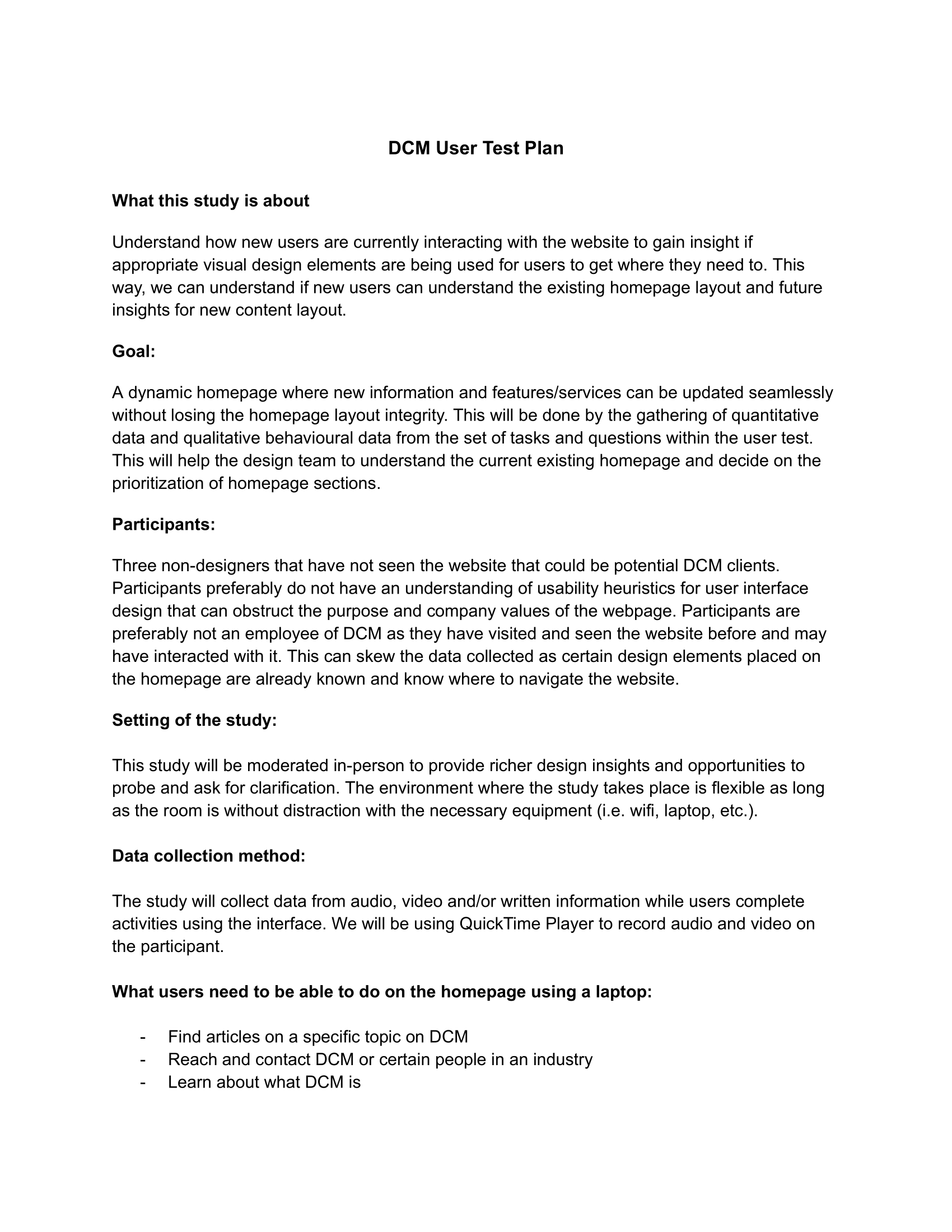
From there, I created a thorough user test plan and recruited three participants who were not familiar with the website.
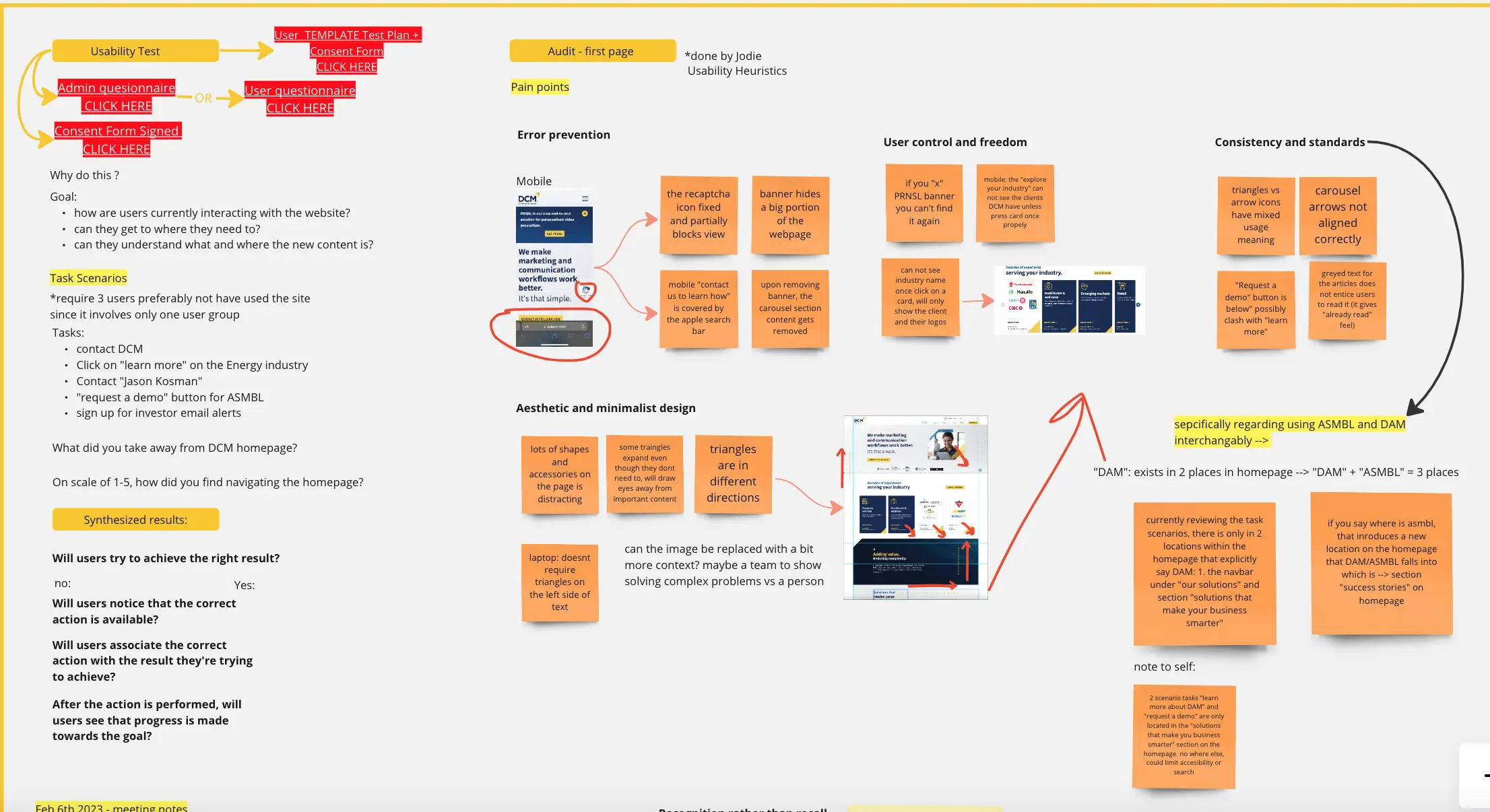
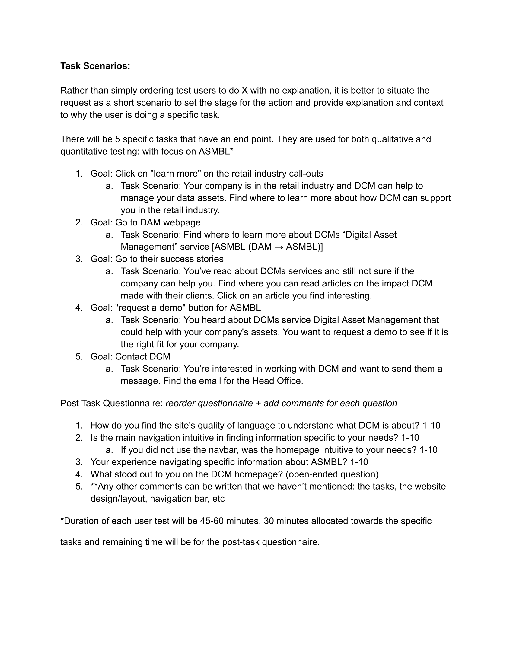
I designed task scenarios that aligned with the perspective of potential clients and also included a post-task questionnaire to gather feedback. To document the user's interactions with the website, I utilized video and screen recording.
Gathering insights via User Testing
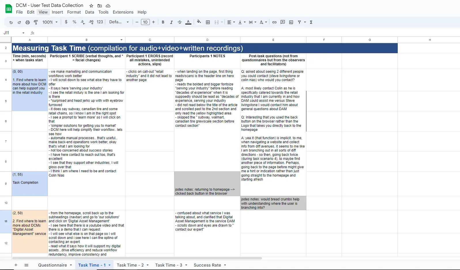
As the facilitator, I led the user test and created task scenarios. During the test, I assigned an observer/note-taker who recorded the participants' actions and behaviors and my supervisor, the stakeholder, to observe additional insights from the user's feedback.
This way, the stakeholders are part of the process directly and can ask specific questions that may help to inform future design decisions that resonates with them and the company.
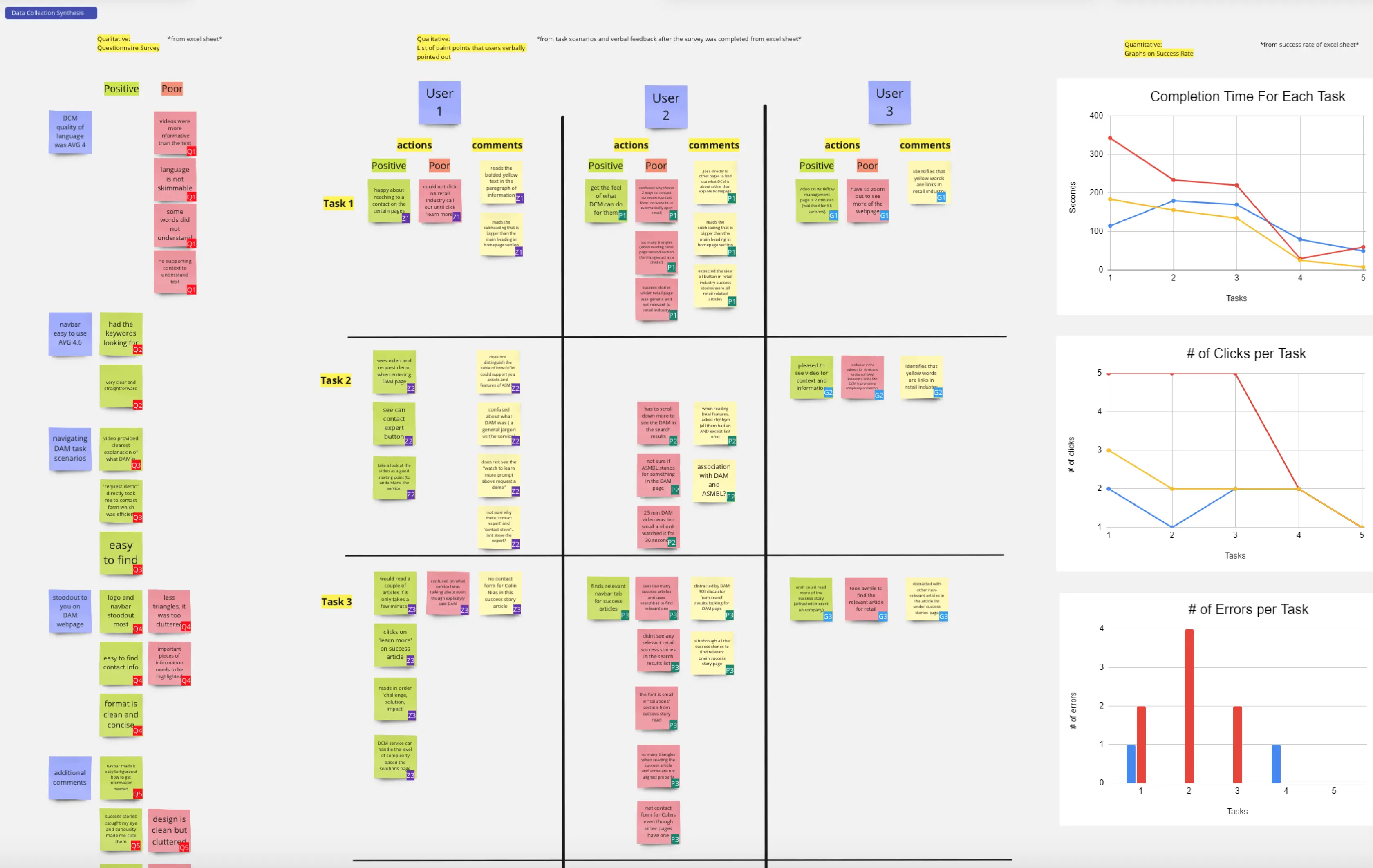
Visualizing User Data per Task
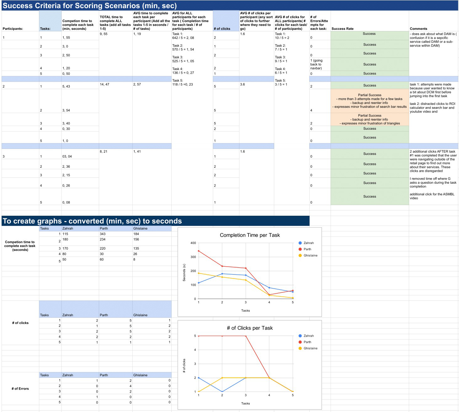
I synthesized the qualitative and quantitative data into a Miro board. I color coded the frequency of positive and poor actions the users took for each task to understand whether a specific part of the interface needs be re-designed.
I quickly added comments/notes during the synthesis phase that pointed out significant user difficulties and ease of use. Additionally, I graphed the number of clicks, errors, and time of each task to quantify the user's performance. This way, I can visually see where users has difficulty on certain tasks and other pain points.
Affinity map to find emerging themes
I took all the notes from above and clustered them to identify emerging themes and patterns from the user test. This helped me pin point promising suggestions for improvements for the website. I also noted areas where users responded positively. This way, the stakeholders understand areas to improve and areas that can do not require changes.
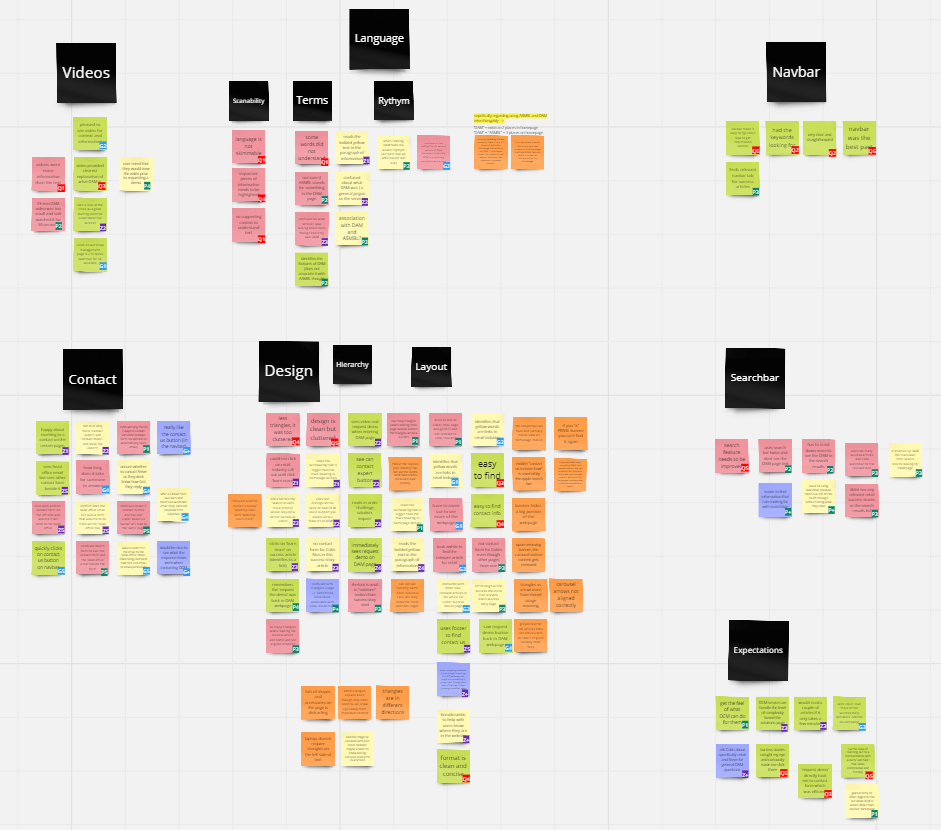
Identified issues:
- Increased # of clicks and time per task as users find it difficult to navigate the website
- Users are confronted with internal DCM jargon resulting in confusion with the services being displayed
- Inconsistent design layout and non-existent design system as new features and services are rolled out onto the existing website.
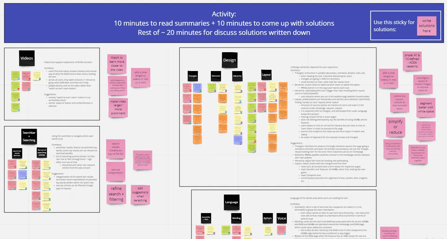
Brainwriting and brainstorming with the team
After summarizing my findings and further grouping them to into common themes. I collaborated with my supervisor, senior UI/UX designer and developer to come up with possible solutions for each theme. We then organized the solutions for the homepage and other webpages.
Prioritizing user impact, time and feasibility
With our design team, we then mapped the solutions on the priority matrix to understand what would be the most impact for the user experience and how much time it will take for the developer.
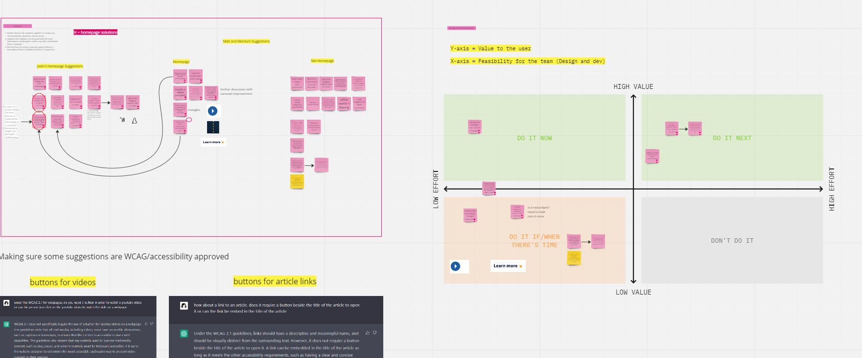
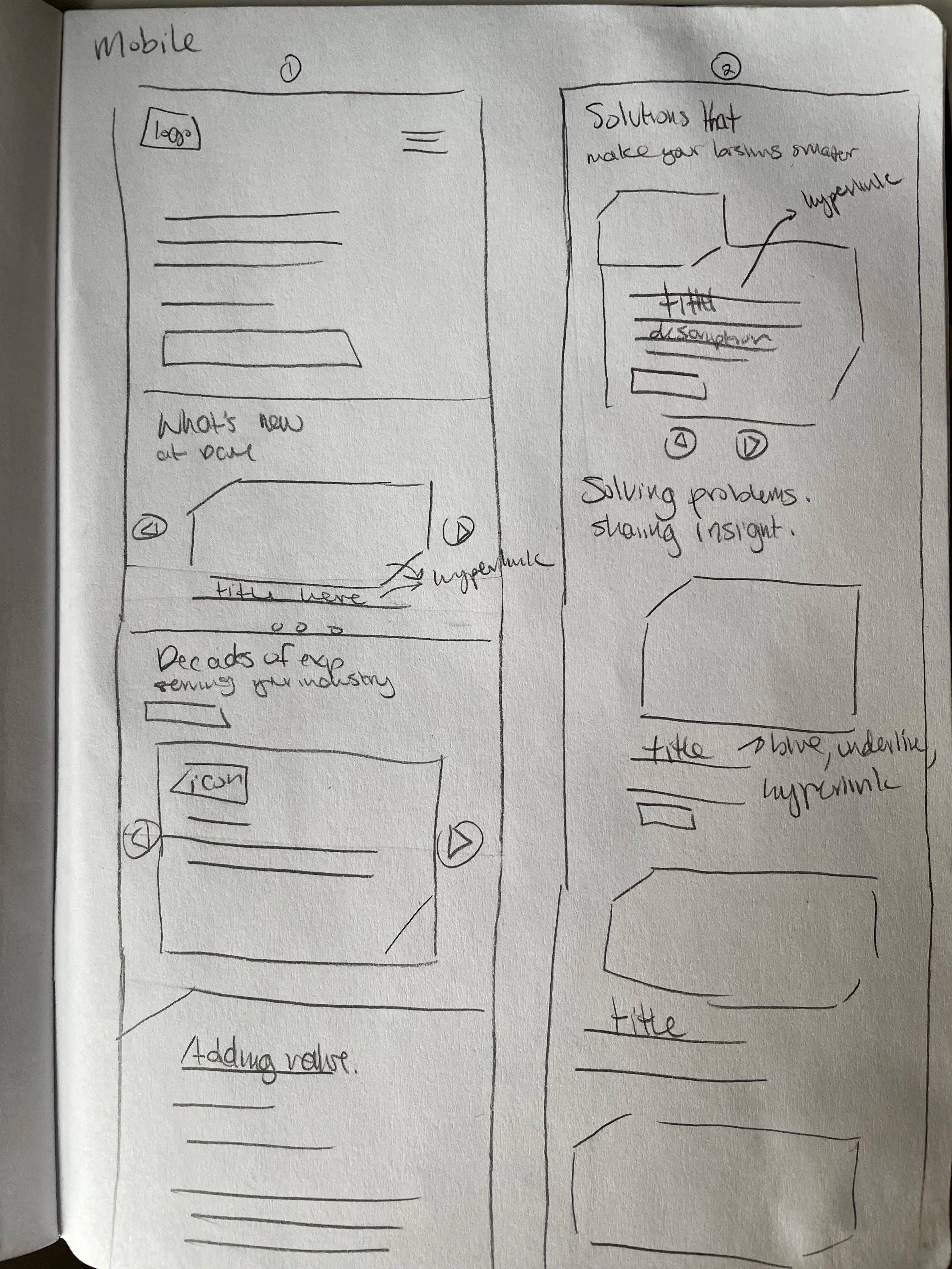
Sketches for Responsiveness
I continued to create the sketches to showcase homepage suggestions based on the priority matrix.
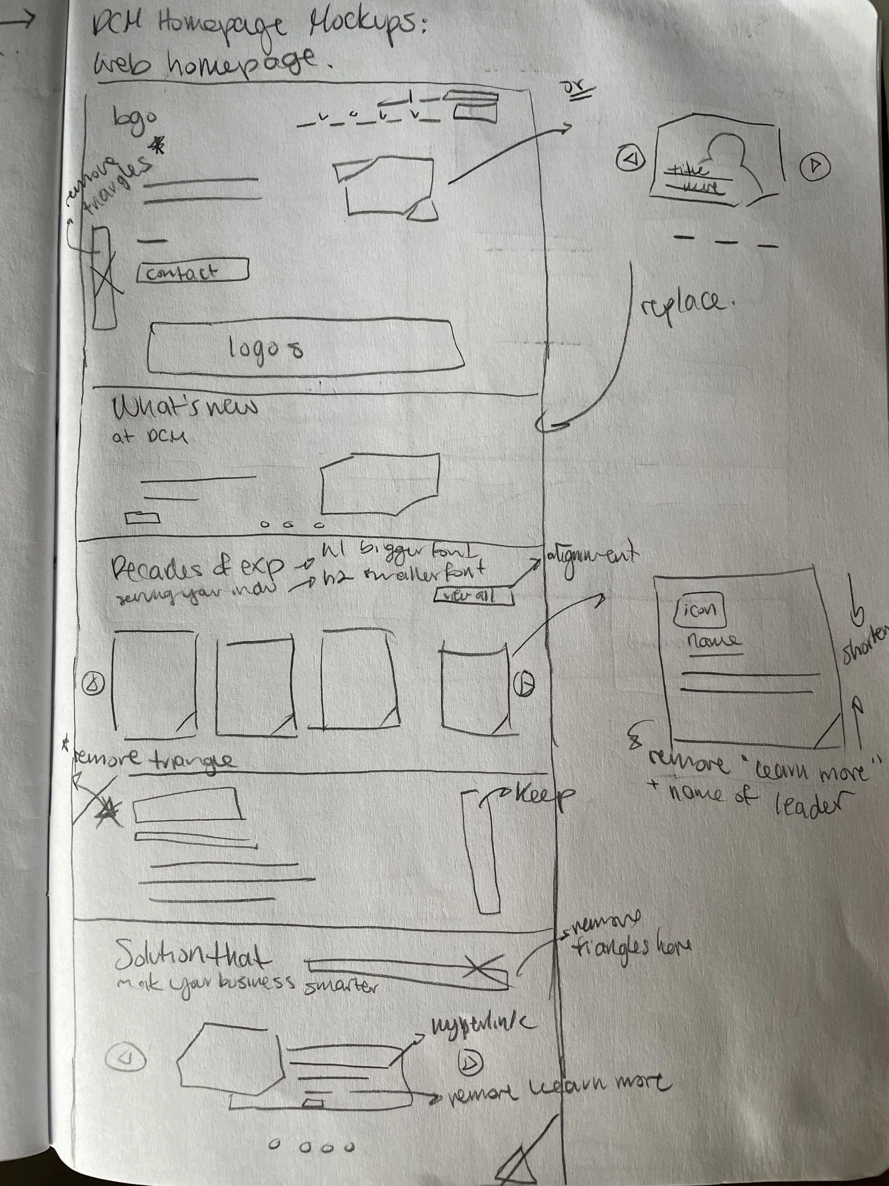
Creating a hi-fidelity mockup of the homepage
I wanted to continued to create the sketches to showcase homepage suggestions based on the team activities.
- Created a new section below the hero section to allow updated information about DCM can be seen here.
- I adjusted the dropdown arrows for the navbar to match the direction of the triangle in the logo.
- Removed the rows of small arrows from the sides of the sections and simplified the card call outs to reduce cognitive overload.
Reflecting on the project outcome and areas of improvement
Initially, I was handed this project with no timeline and open to how I wanted to approach it. I took this to create my own deadlines, user test plan, and how to synthesized the data. I uncovered really compelling insights that resonated with my supervisor, senior UI/UX designer and the developer.
Some key takeaways from this project are:
- Areas for improvement in my user testing process. While I was able to create my own methodology, I realized that incorporating additional resources and steps could have provided even richer insights. Moving forward, I plan to explore different approaches and expand my toolkit to refine my testing process and better serve user needs.
- A key lesson I learned from this project is the importance of fostering collaboration with all stakeholders. Through my interactions with the design team, I gained valuable insights into their expectations and preferences, which helped me make informed design decisions.
More fun stuff I’ve been up to